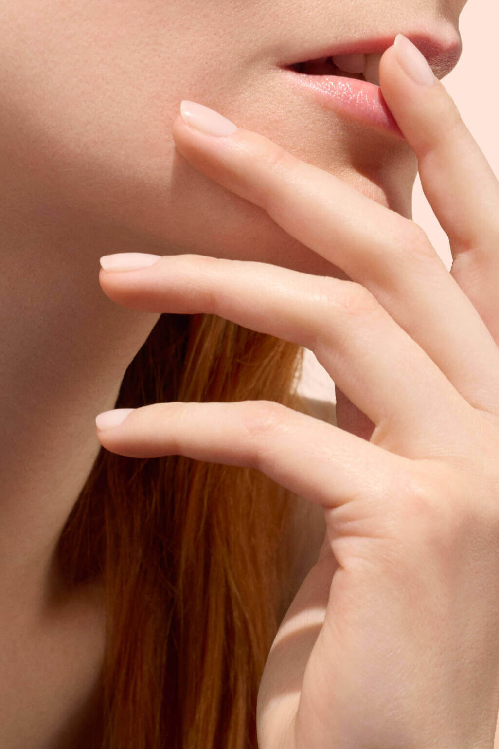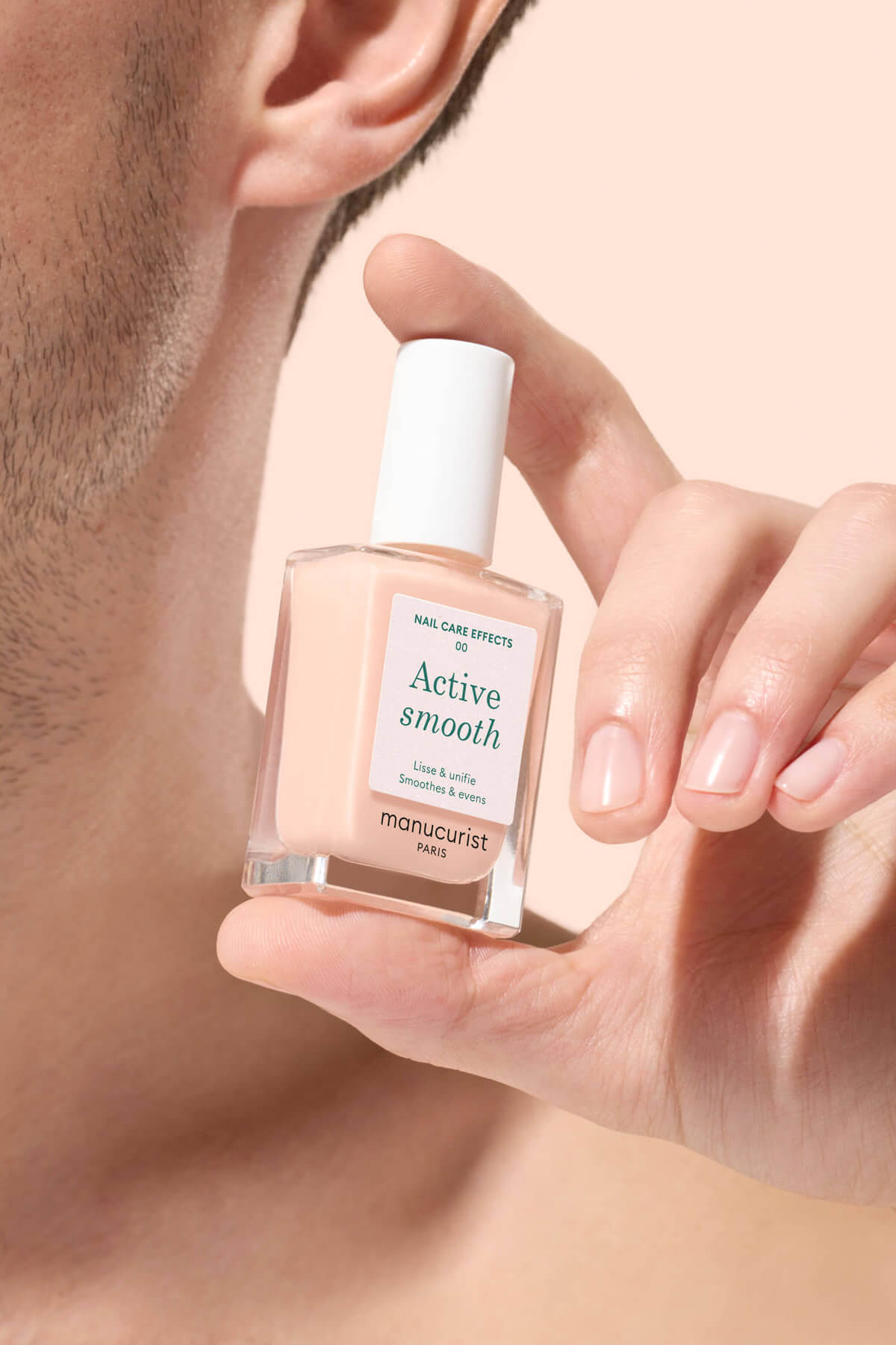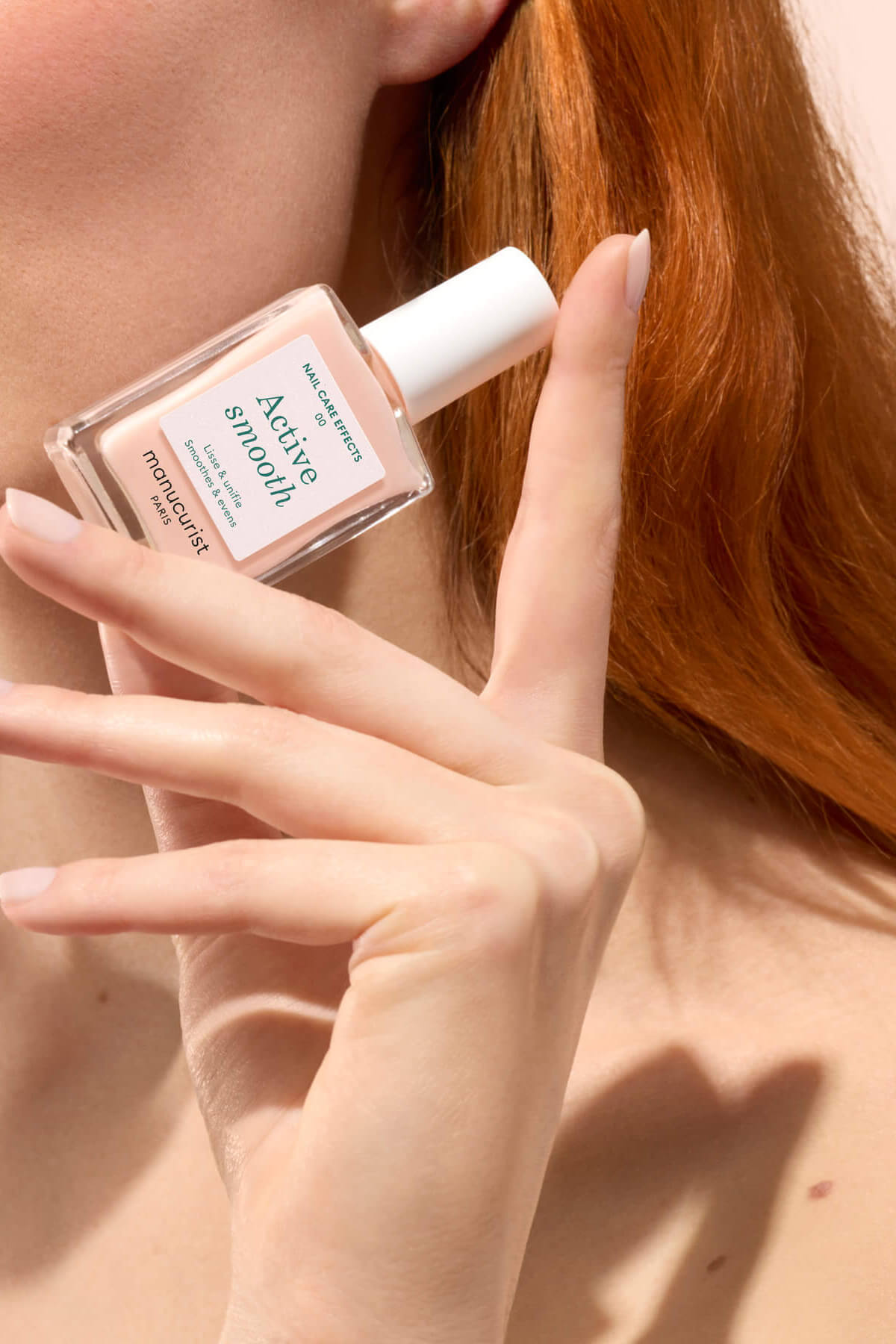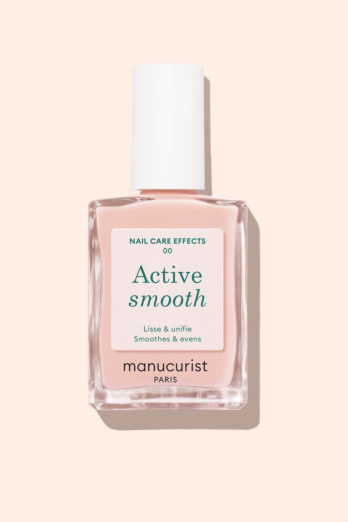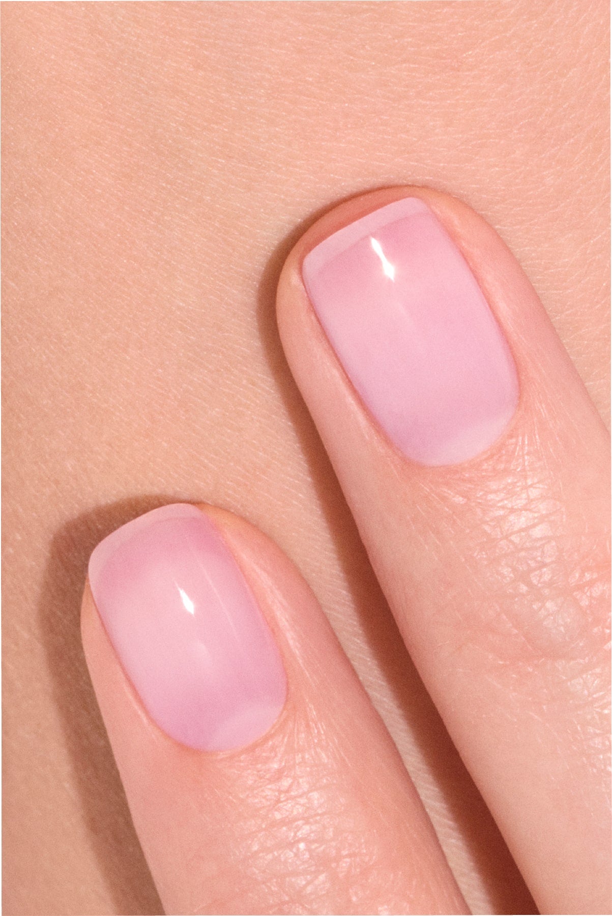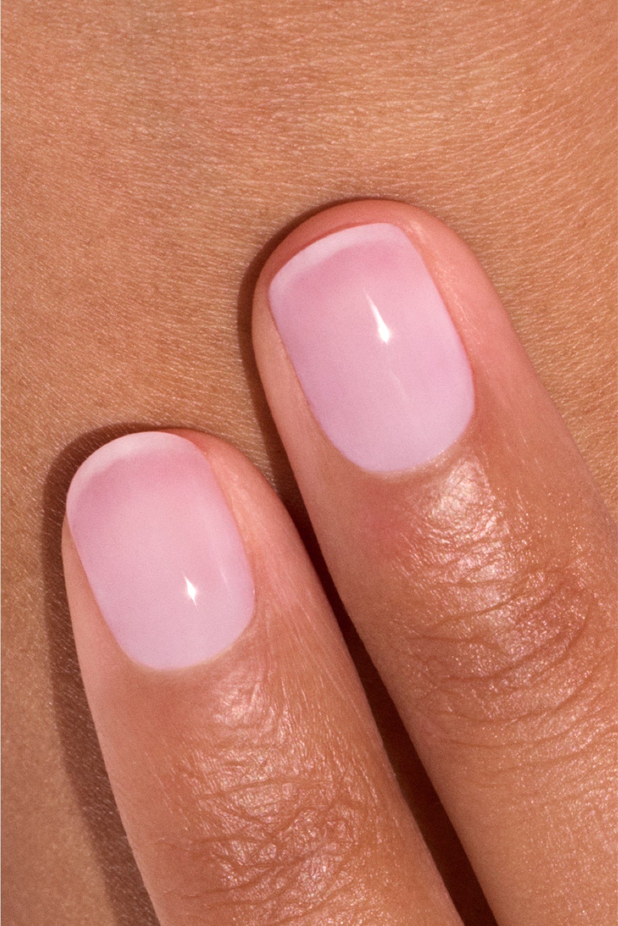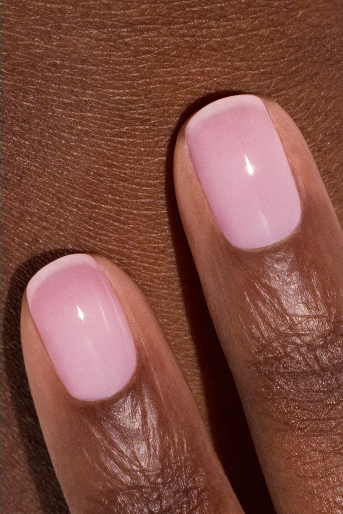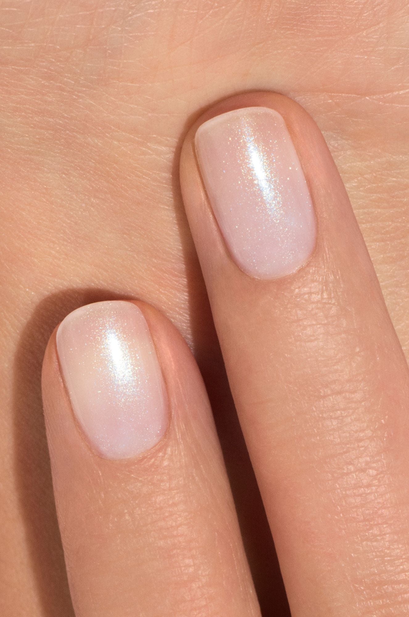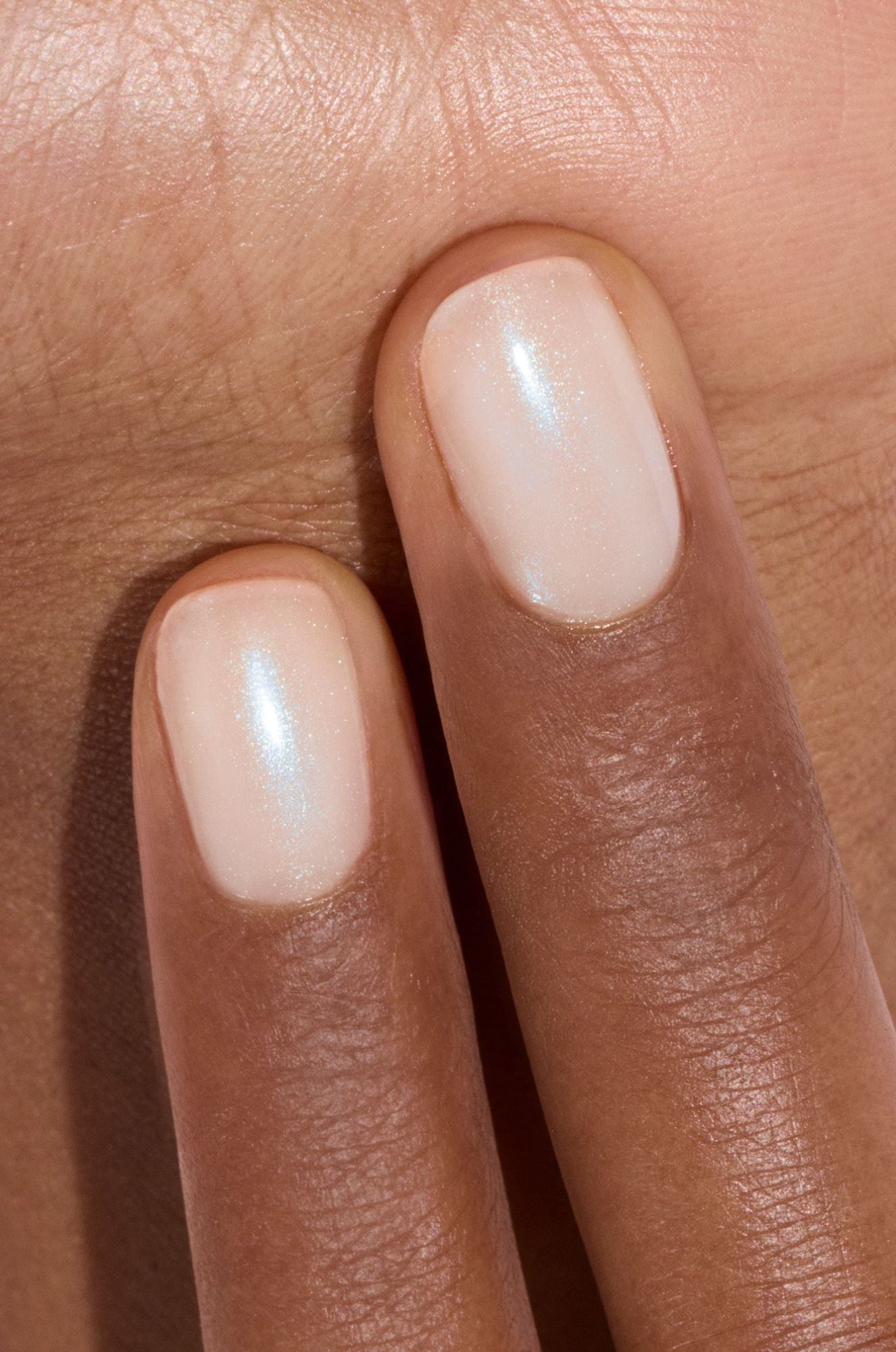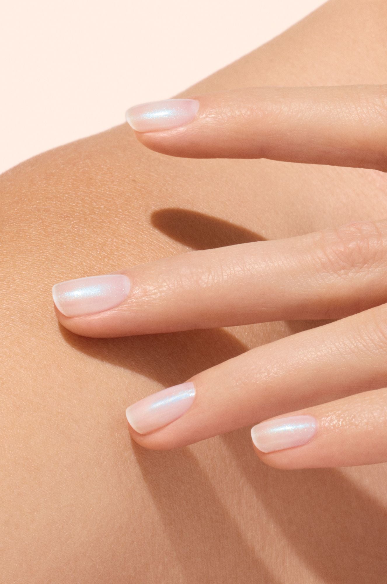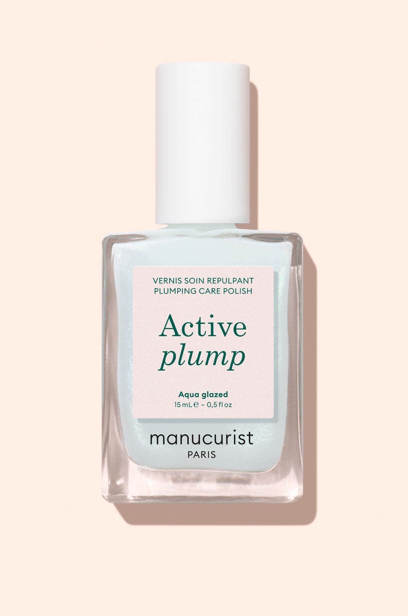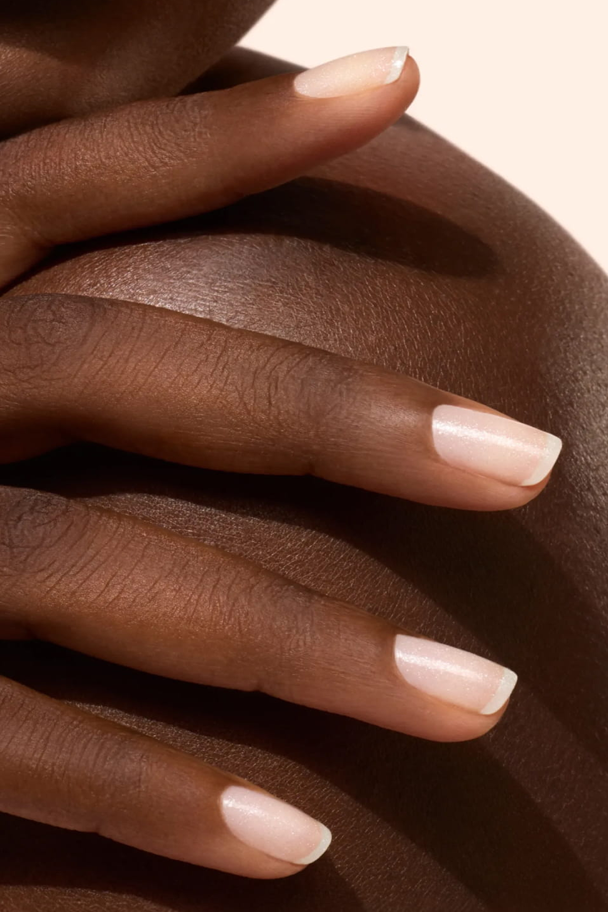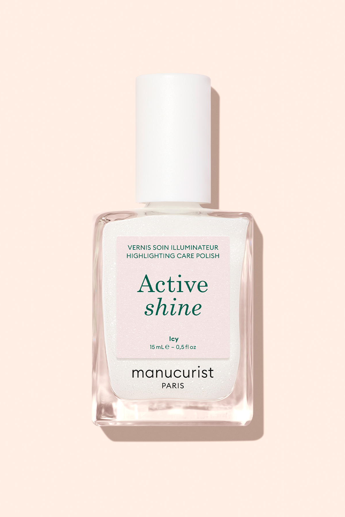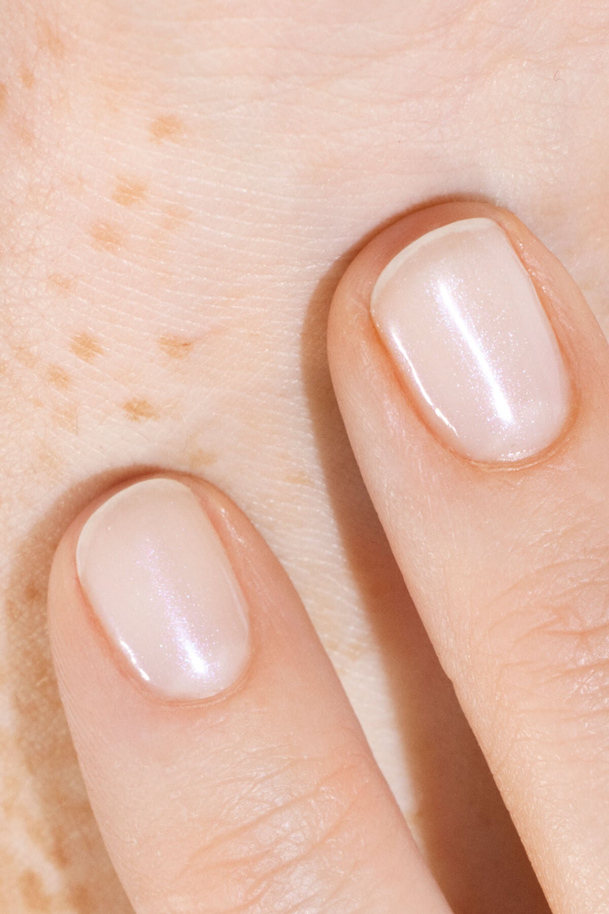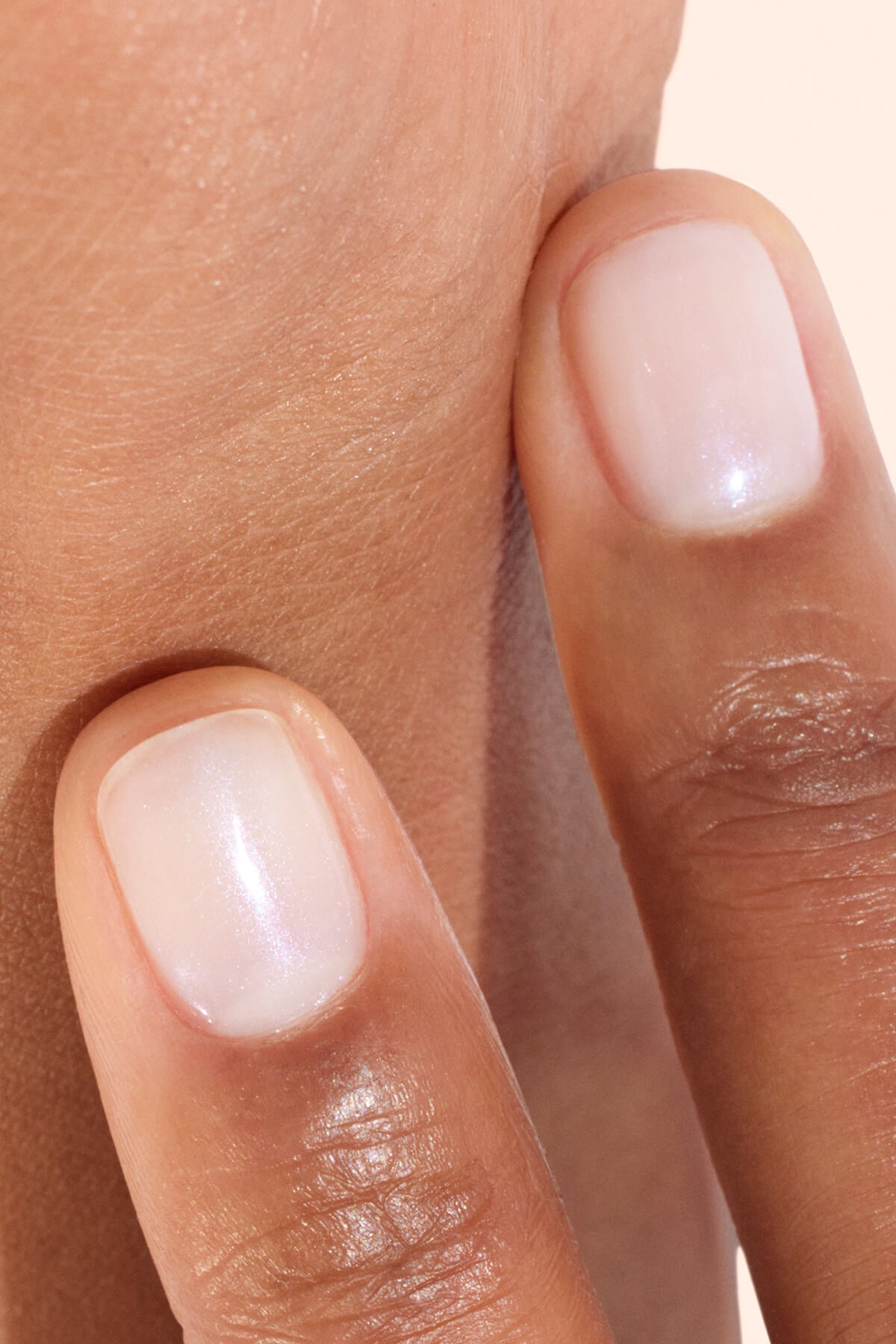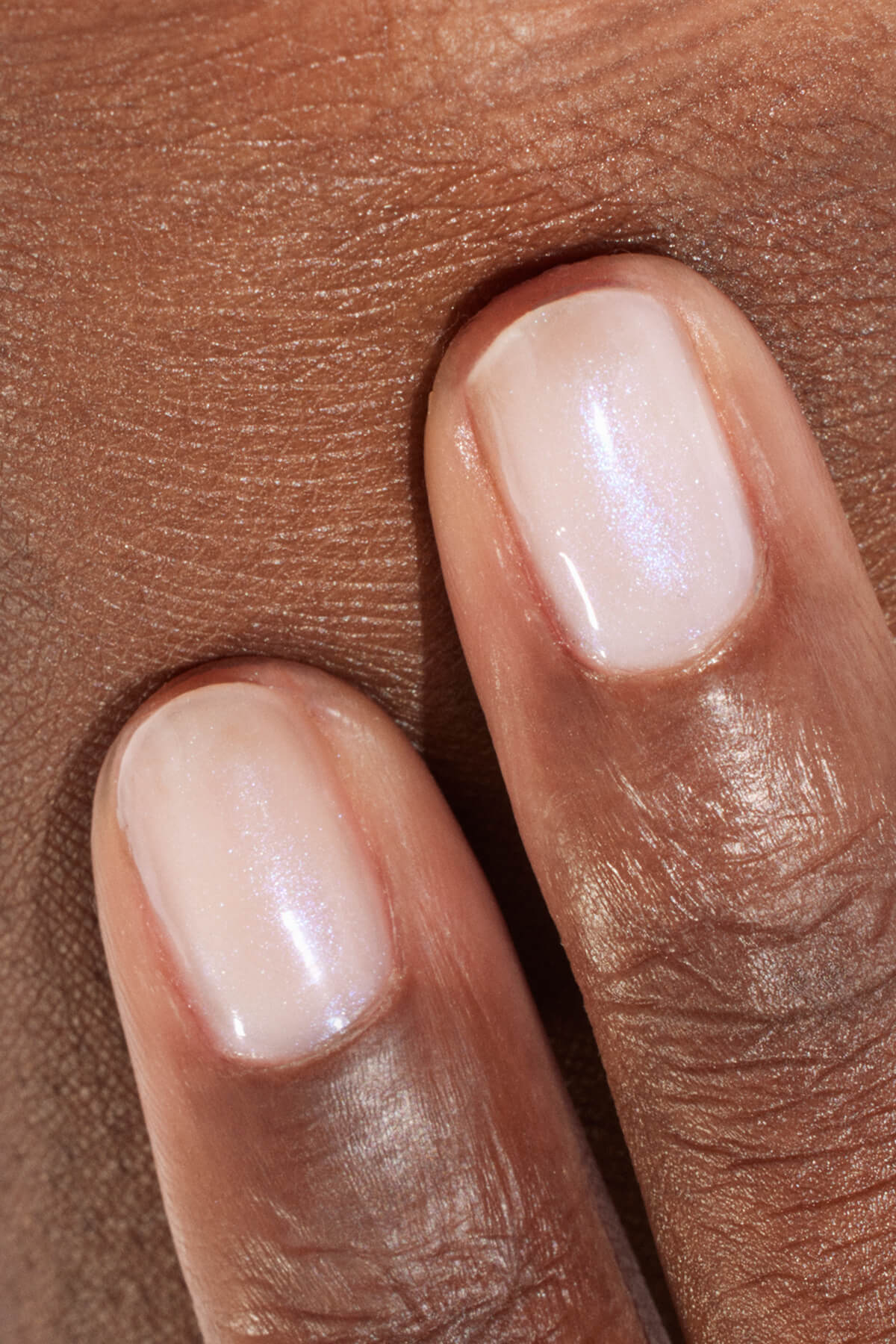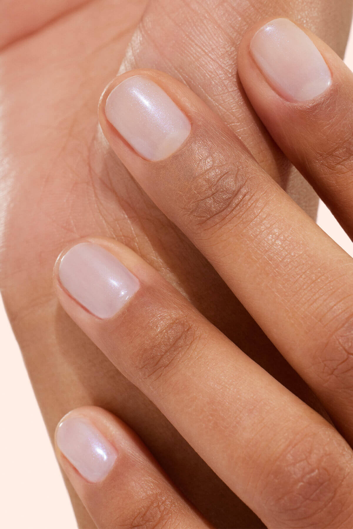


Have you ever wondered why some colors illuminate your complexion, when others seem to tarnish it? The answer is on the colorimetry side. This method is long reserved for image professionals and is now experiencing a renewed popularity. On social media, color analyses become viral, each seeking to know its personal palette in order to compose a more harmonious wardrobe, choose the right makeup or nail polish colors that naturally sublimate its hands. Here is a comprehensive guide to help you see more clearly and understand why this approach has been so popular in recent years.
By Emmanuelle Rivière, beauty editor and certified image consultant
What is colorimetry?
Definition
Colorimetry is a method of image advice which consists of identify the most harmonious colors according to each person's natural characteristics. Colorimetric analysis takes into account different elements:
- carnation,
- the skin's undertone,
- the colour of the eyes,
- the color of the hair.
The goal? Create harmony between the person and the colors that he or she wears, reveal the hues that illuminate a face and sublimate an appearance. This technique helps to understand why some colours immediately give good look while others seem to harden the lines or tarnish the complexion.
Colourimetry is used in image consulting The European Union has been working on the basis of a simple principle: each person has a palette of colours which is naturally more flattering.
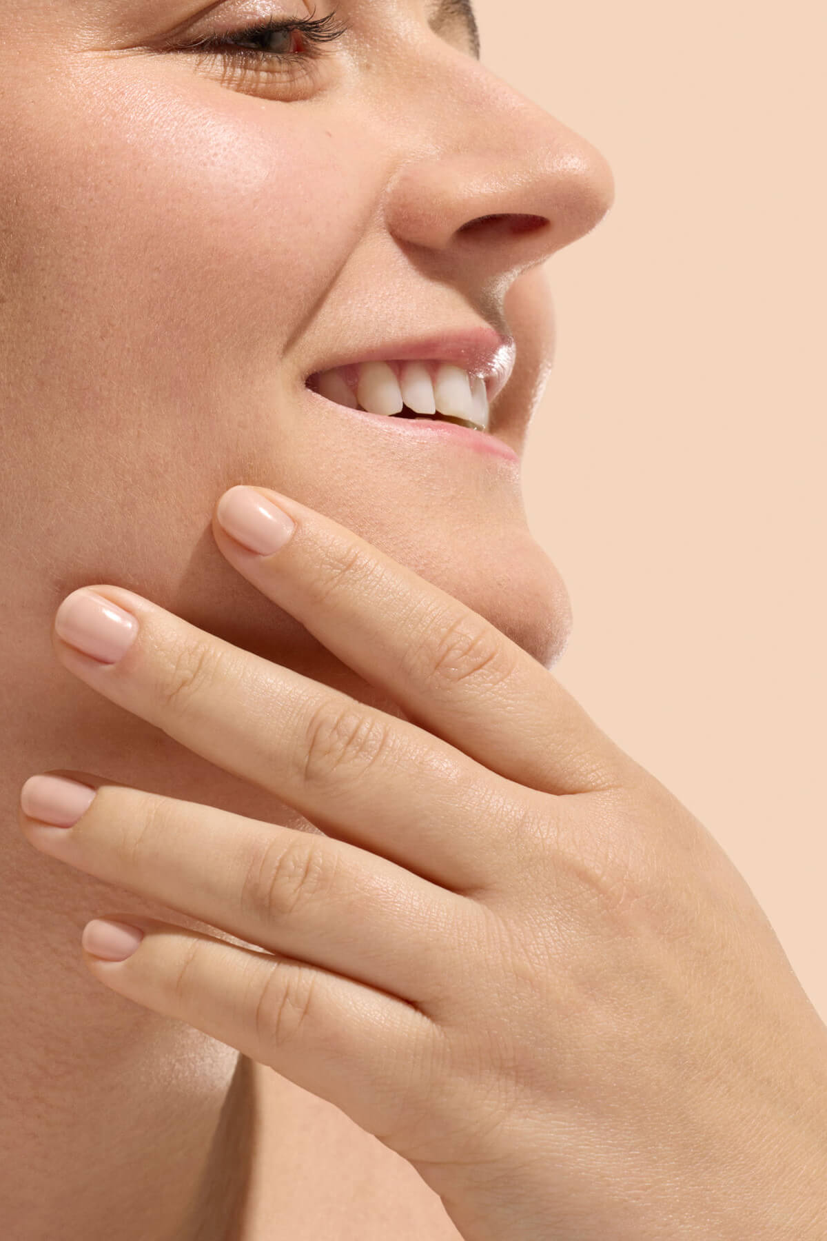
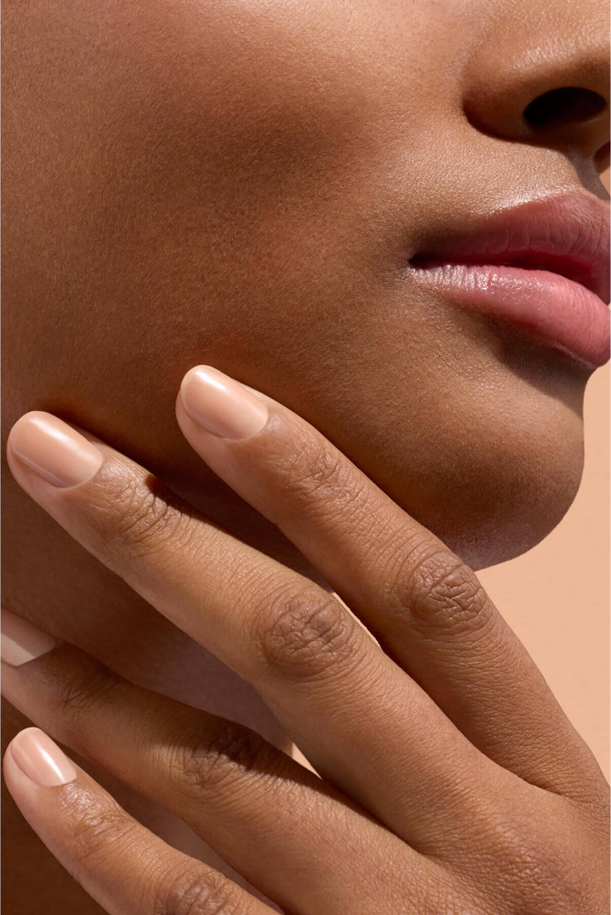
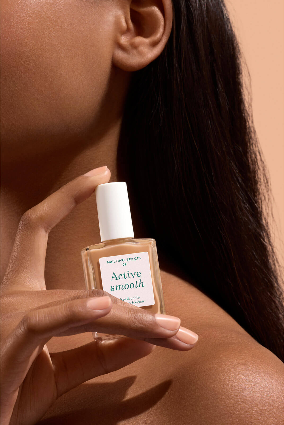
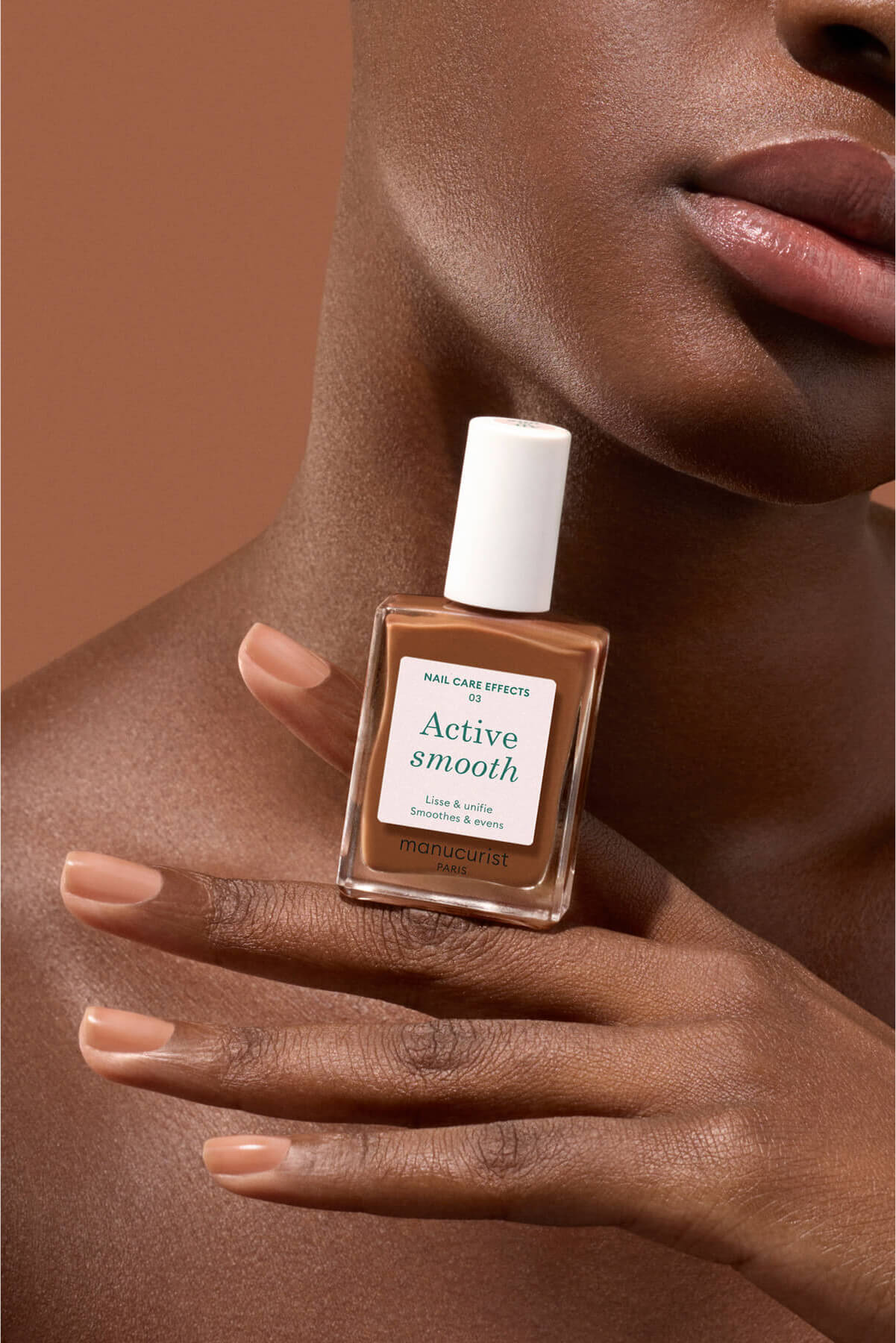
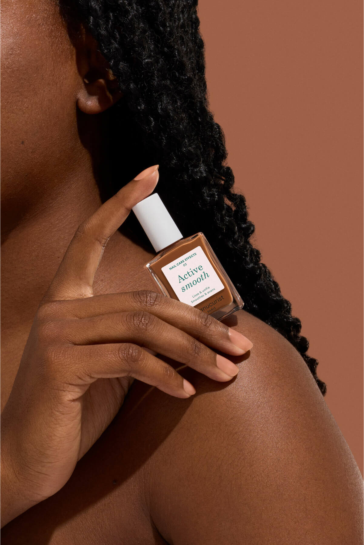
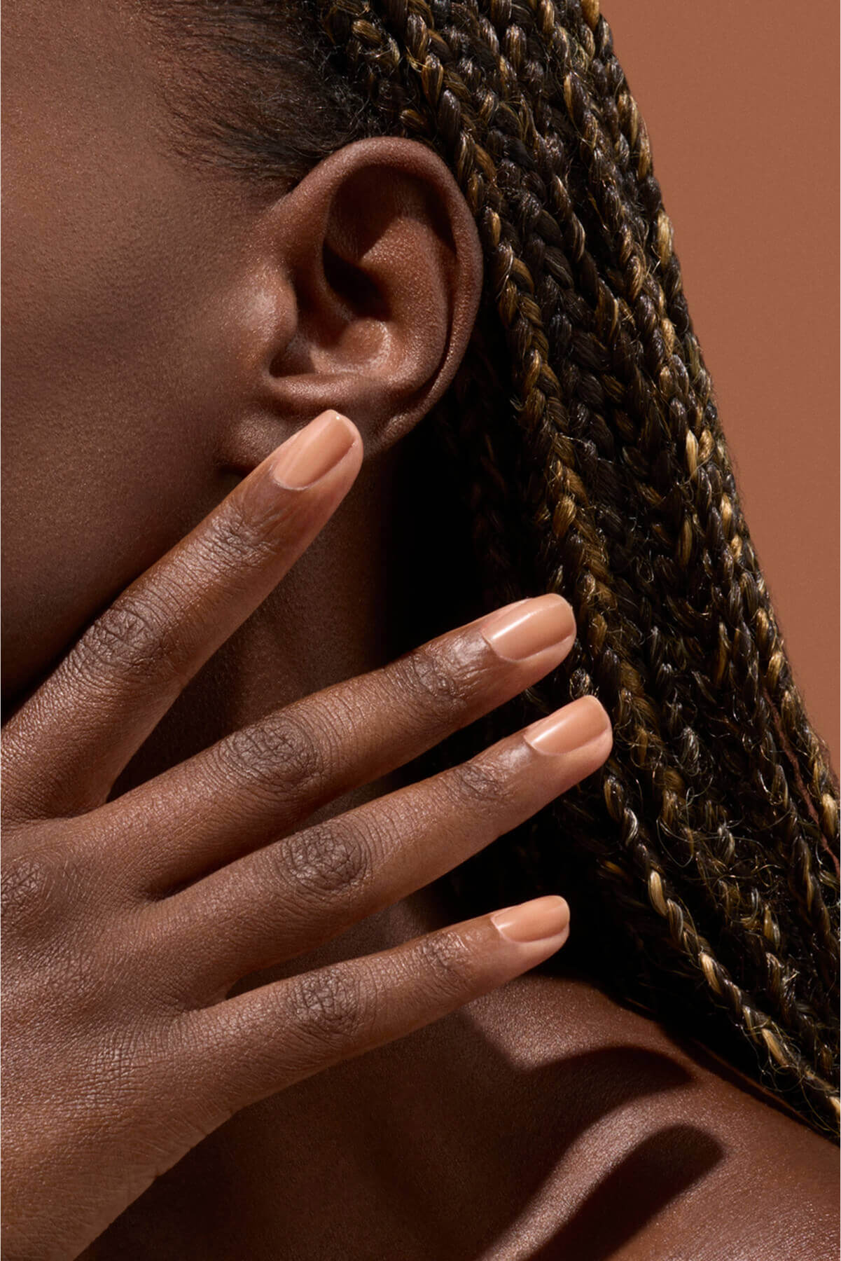
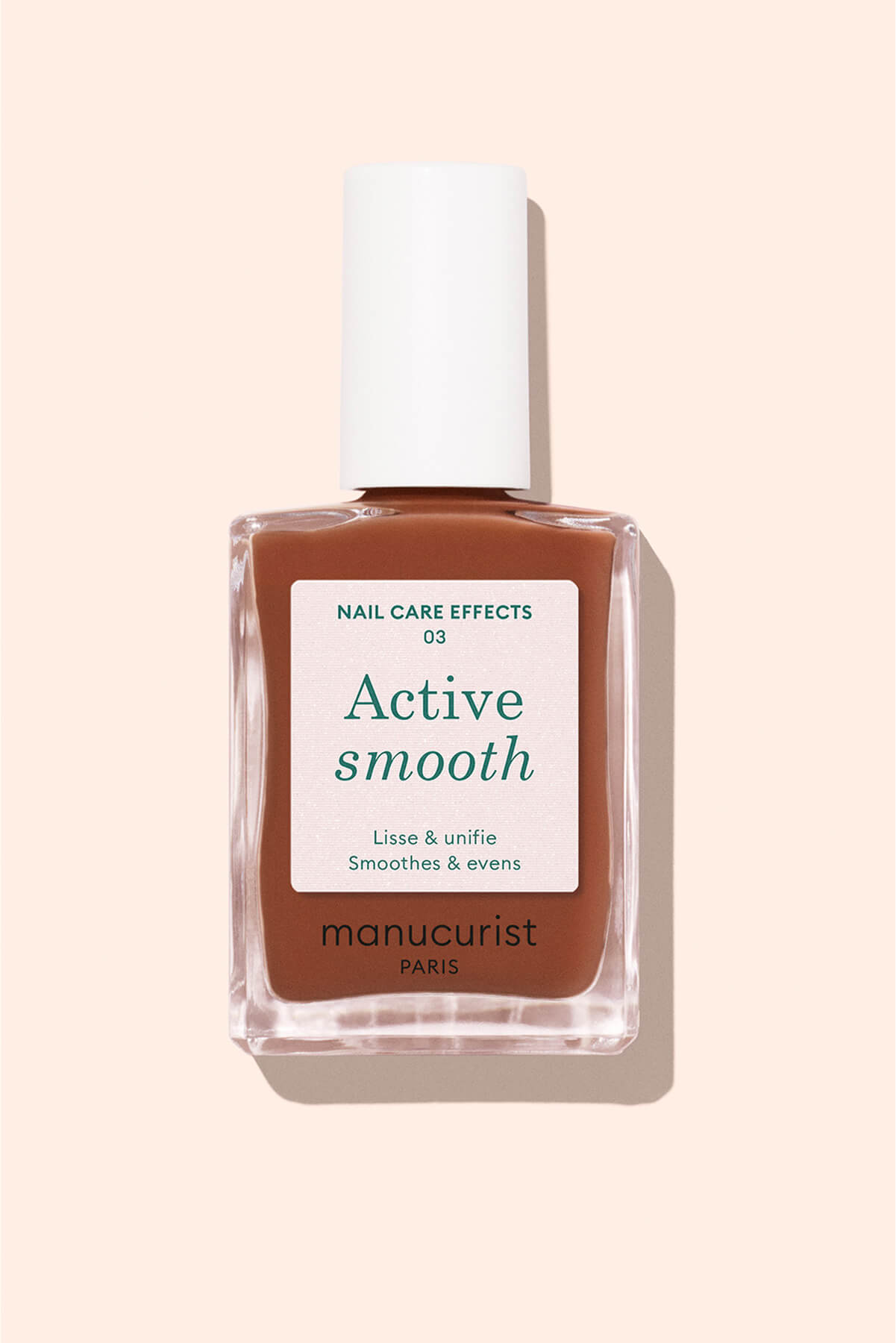
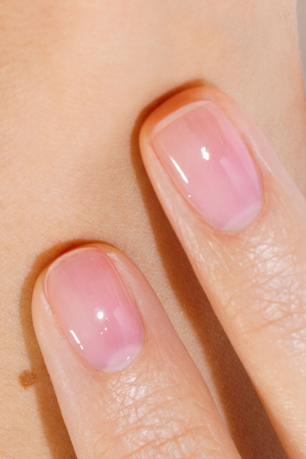
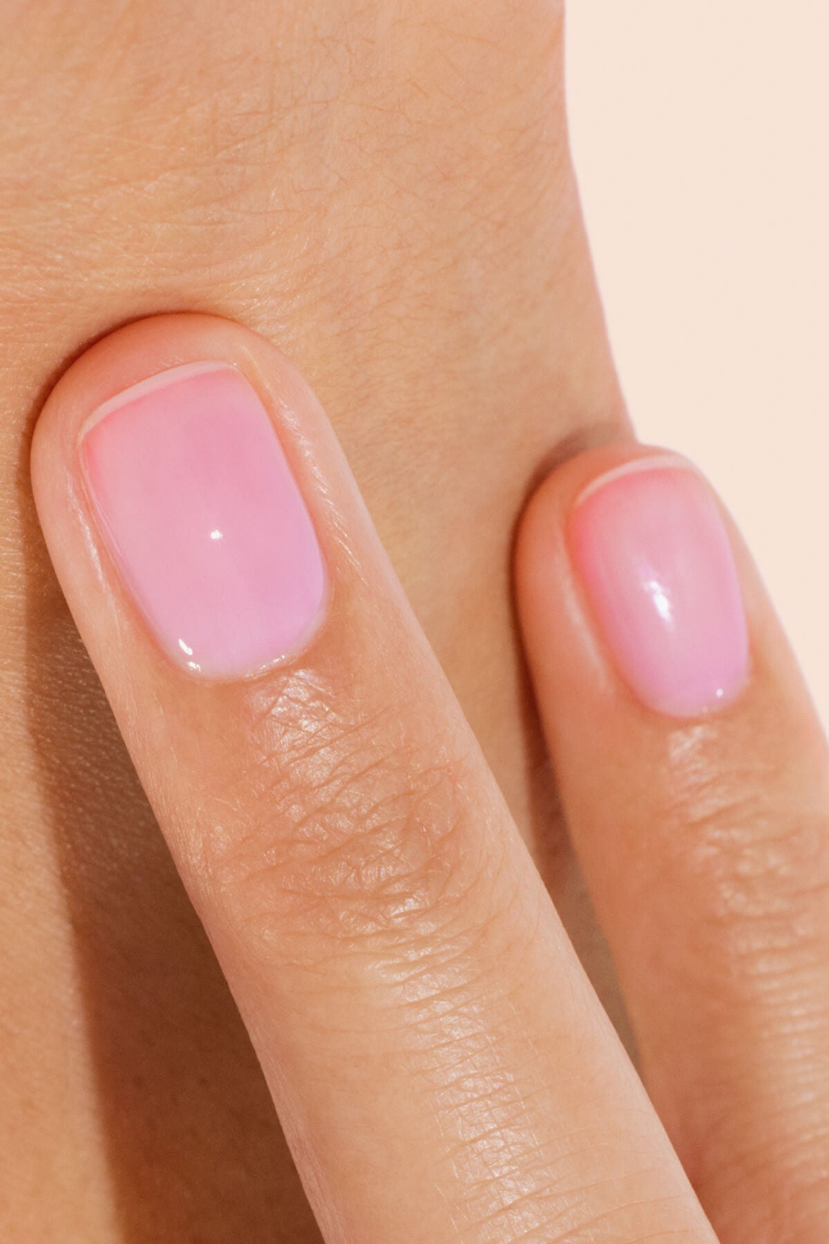
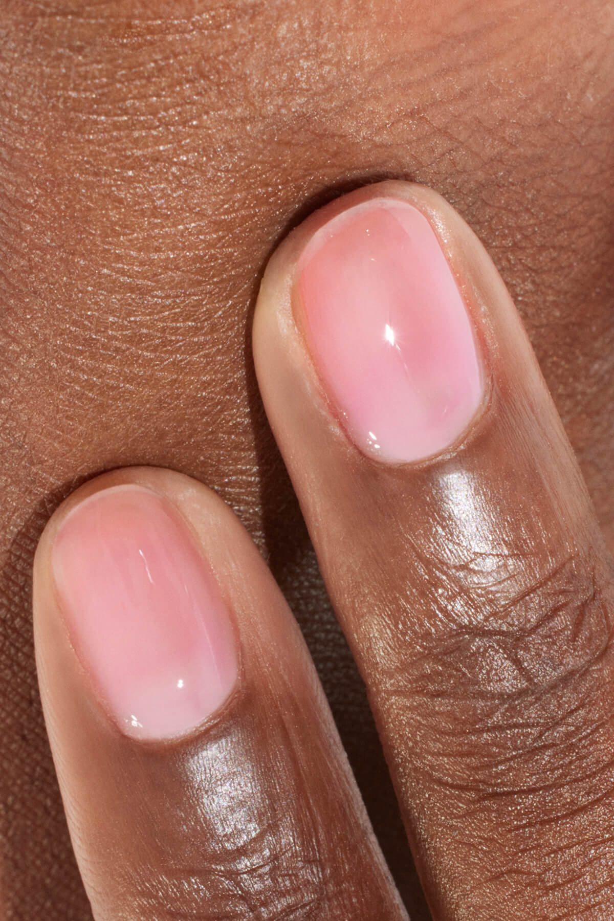
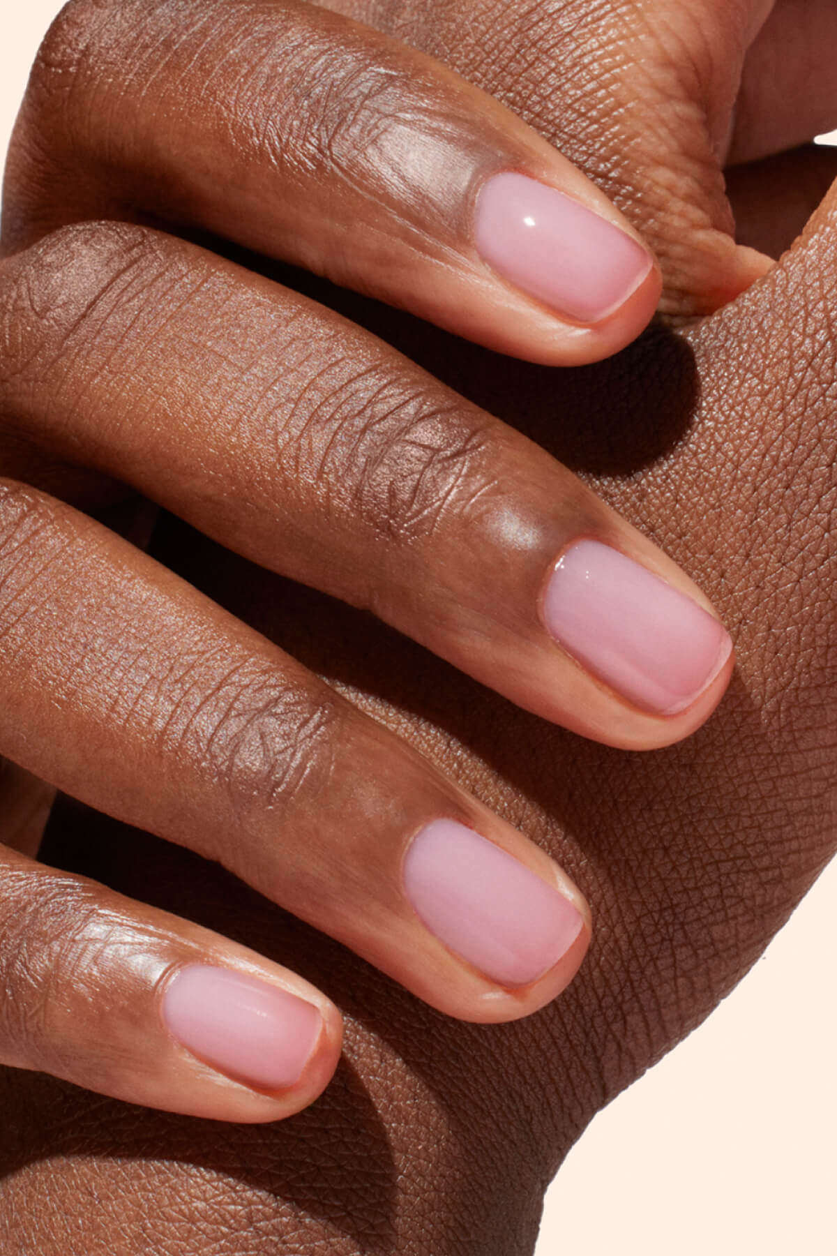
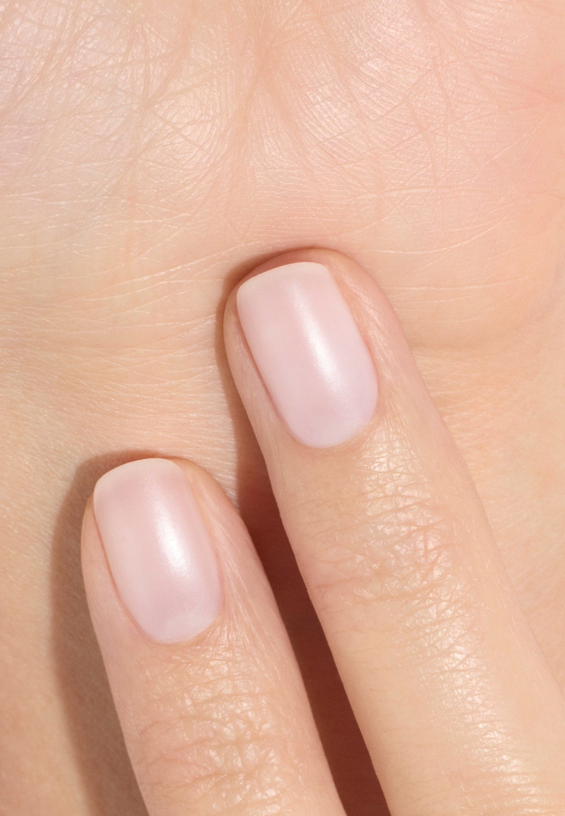
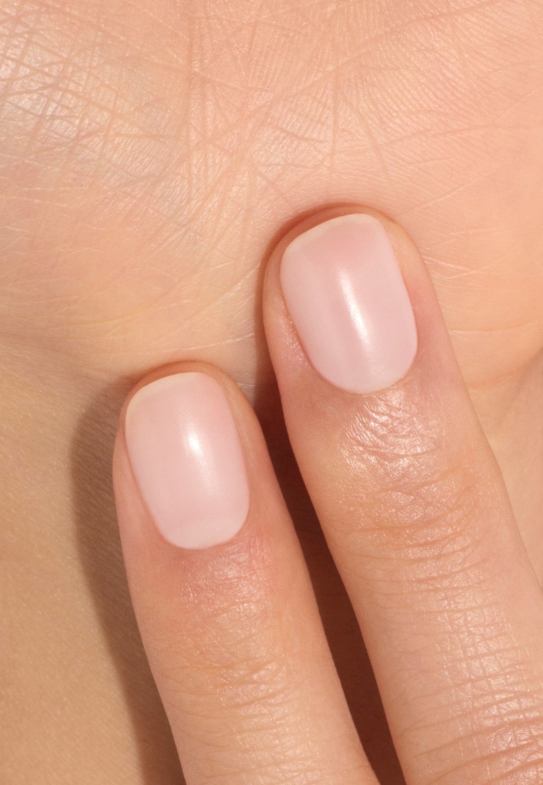
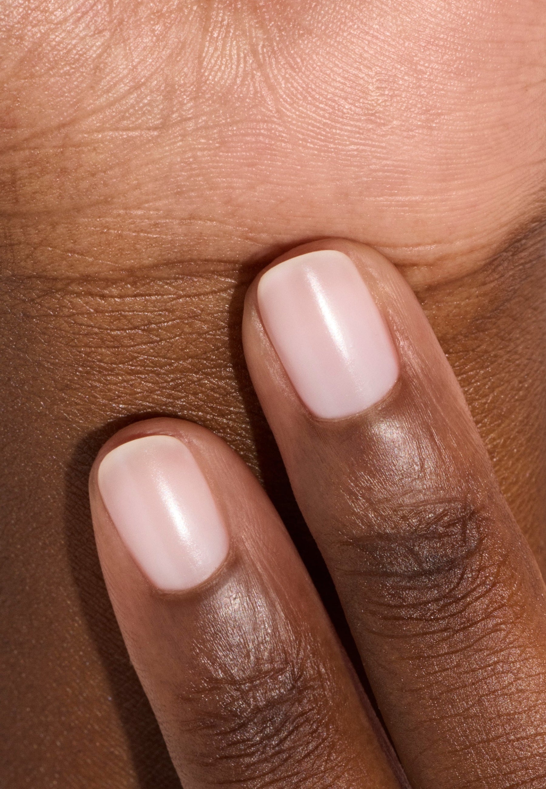
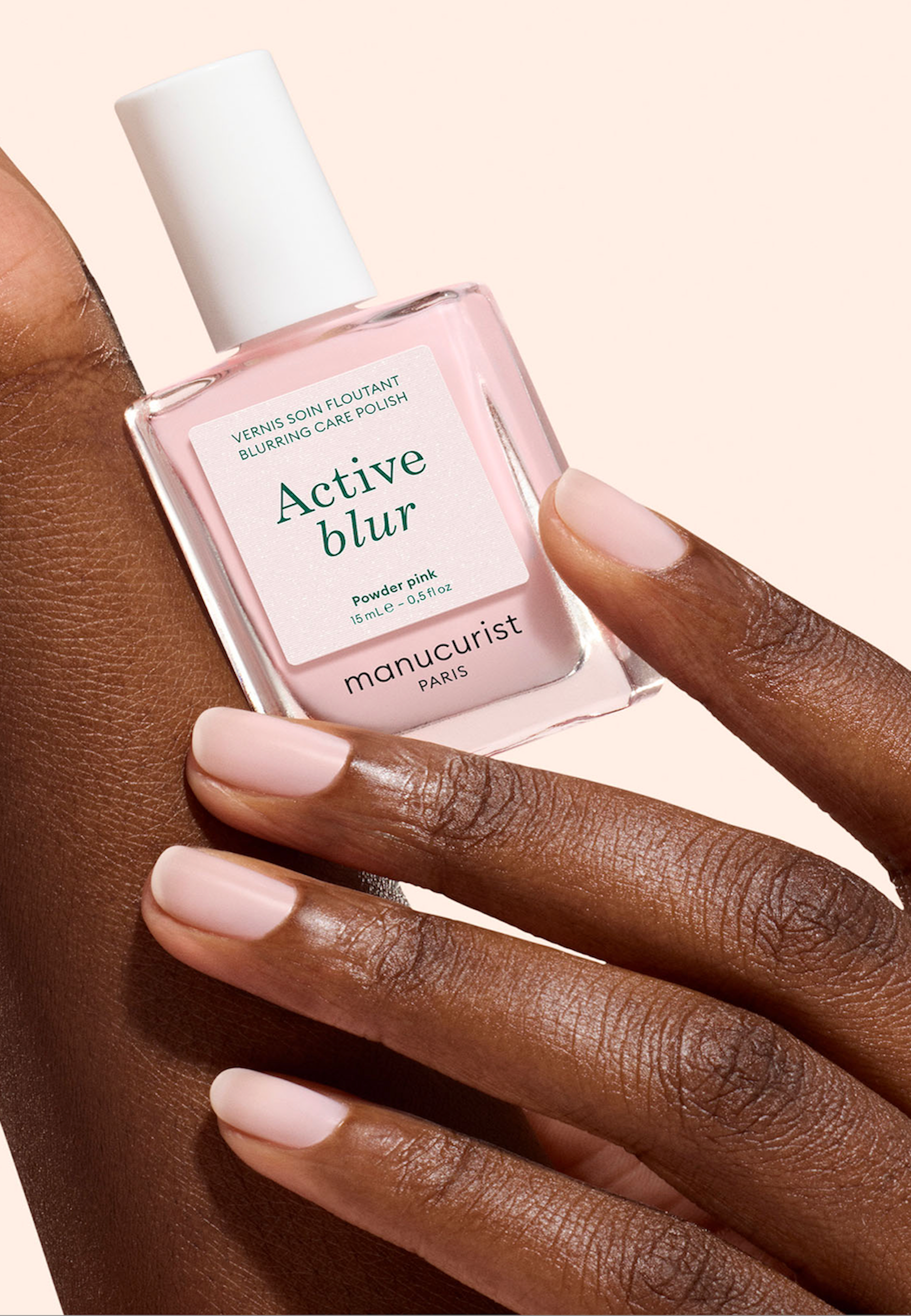
Today, this method no longer concerns only the clothing. It also influences the choice of Makeup, the hair coloring, accessories and even, as we will see here, from the manicure - I'm not. And yes, because a varnish color does not only dialogue with your outfit: it is directly contact with your skin. A perfectly chosen shade can therefore enhance your hands with great elegance.
To go further on the choice of varnish colours according to your carnation, also discover our articles dedicated to Clear skins, medium skin and dark skin.

Your skin colour but also your undertone, eye and hair color are to be taken into account in defining your color palette.
Why do you know its colorimetry changes your image?
Knowing its colorimetric profile allows you to compose a coherent palette that simplifies many situations in everyday life. Profits:
- The clothes seem more harmonious.
- Make-up is more flattering and natural.
- Jewellery is more easily found in their place.
- The varnish colours naturally match your carnation.
Another advantage: setting your palette greatly improves shopping! When you know the colour families that value you, purchases become more thoughtful and easier to associate. The colorimetry therefore consists of creating a real chromatic compass.
How do I know his colorimetry?
What if we move from theory to practice? Some techniques allow for start this exploration for yourself and to obtain first indications, without particular equipment. For a more detailed diagnosis, turn to an image advisor who will really enlighten you on the subject.
👉Note : Always observe yourself in daylight, without makeup and wearing a neutral colour garment.
Identify the subton of its skin
The first item you can look at is your skin subton. Image advisors define it as the way the skin reflects light. Be careful, then. do not confuse it with your skin color - I'm not. You can have very clear, matt or dark skin with a warm or cold subton. Three large subton families are generally distinguished:
- The warm subton : your skin has shades golden, peach or slightly yellow. The warm colors will light you naturally.
- The cold subton : your skin pulls more towards pink, pink beige or blue shades. Cold colors create more harmony in your home.
- The neutral subton : your skin has a balance between hot and cold. You can wear a wide range of colours with great ease.

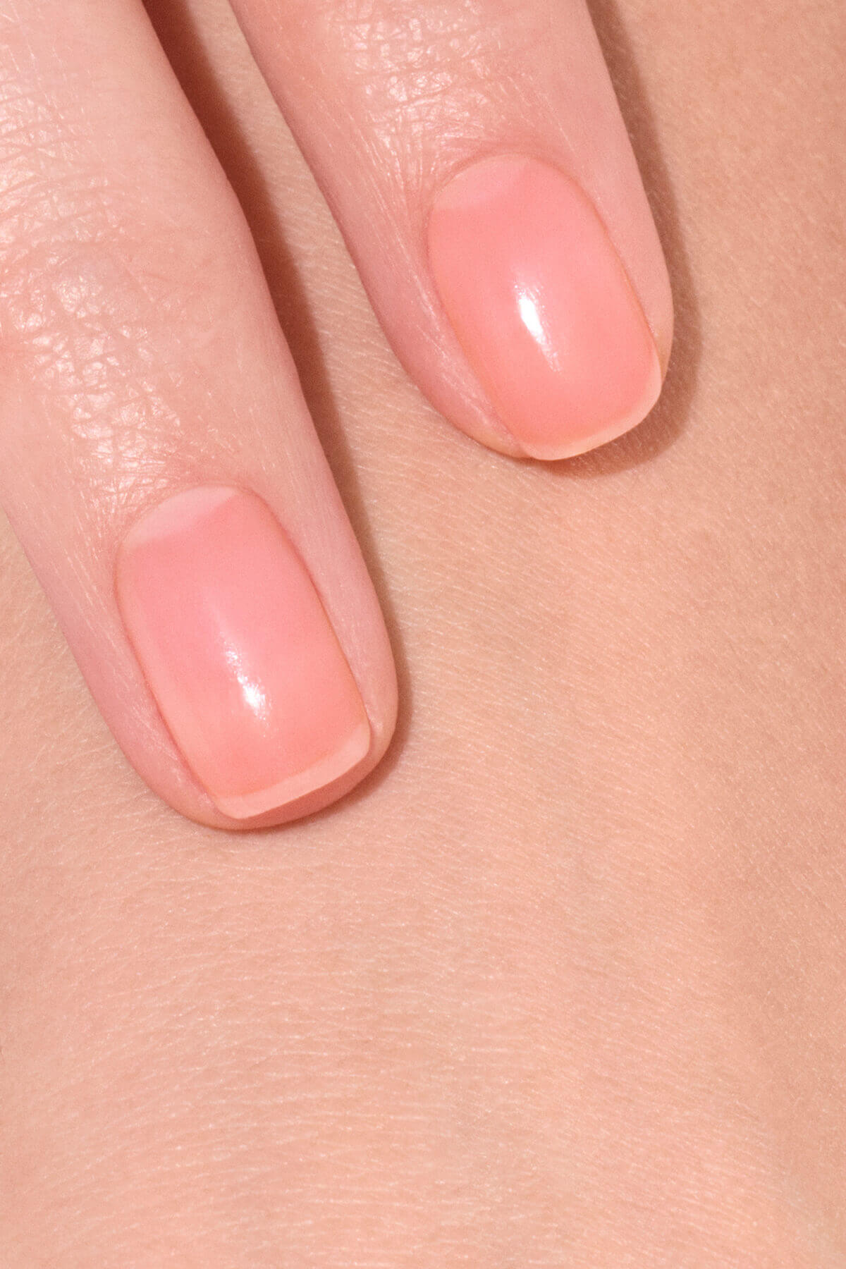
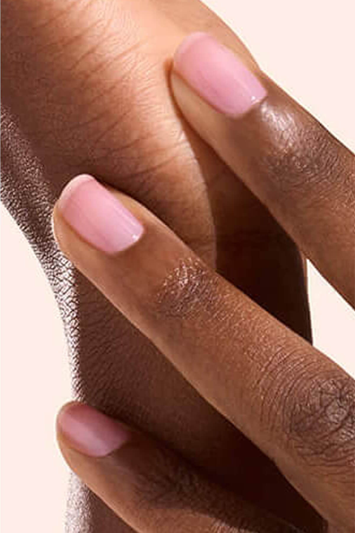
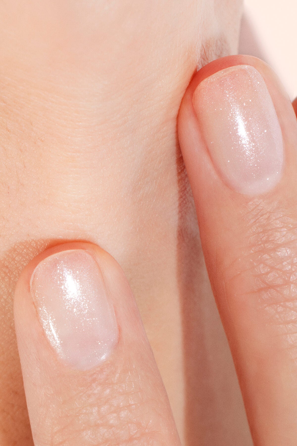
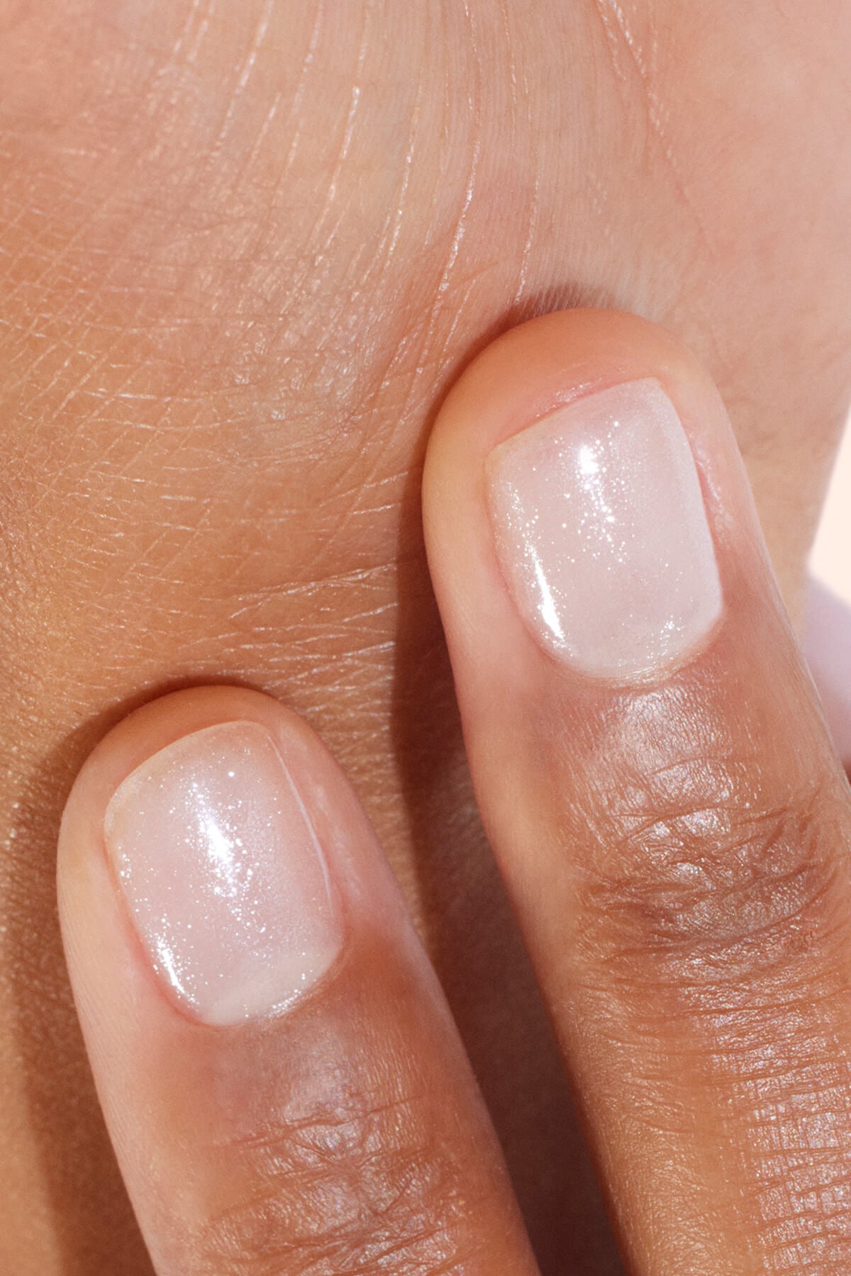
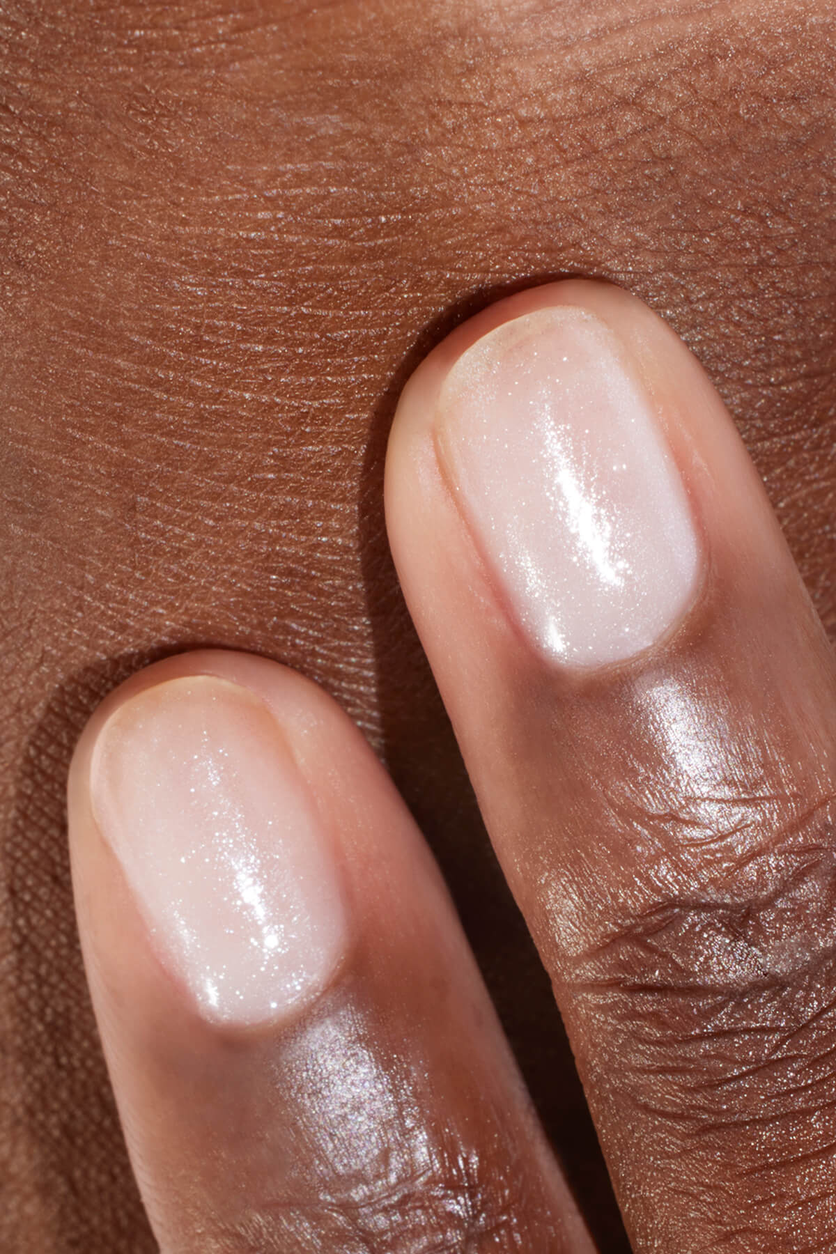
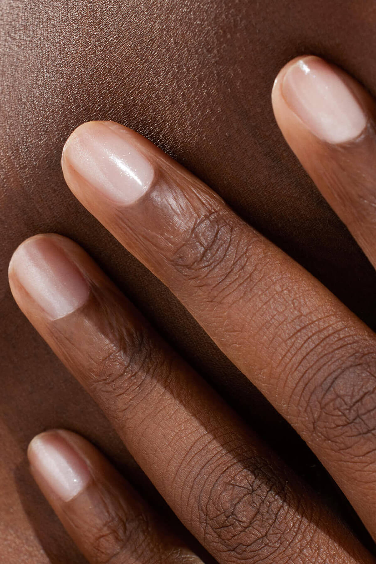
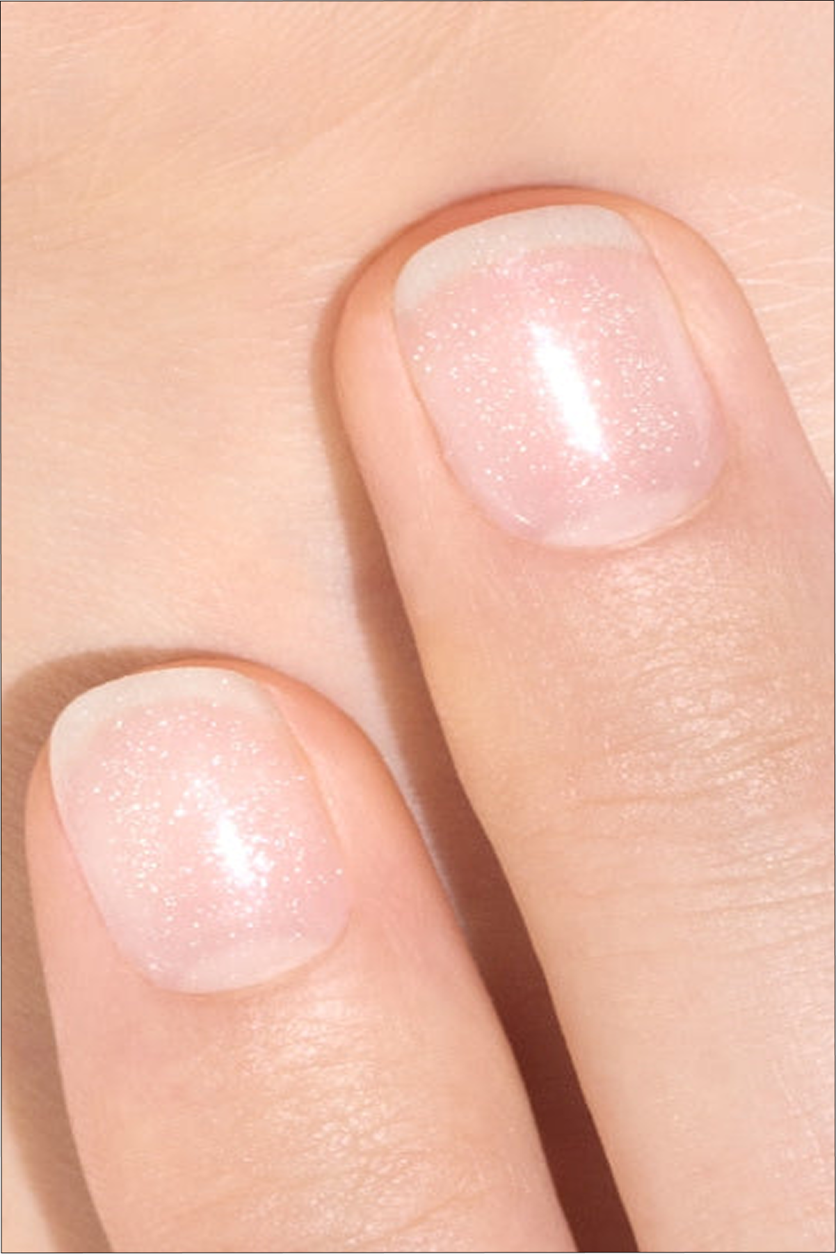
Hortencia and Pomegranate, two shades of varnish that blend perfectly with cold skin. (@mani.minimalist)
`The vein test
It is probably the most well-known and widespread test. Observe the veins inside your wrist:
- They appear rather green - What? Your subton is probably hot.
- They seem to be blue or violet - What? Your subton is tending to the cold.
- You're not sure. between the two - What? Your subton is probably neutral.
This express test should not be interpreted as absolute truth because, in reality, the apparent colour of your veins depends more on the thickness of your skin and your tanning level than on your true skin undertone.
Gold and silver test
Another very popular method: compare gold and silver jewellery. Place a gold jewel and then a silver jewel next to your face (without your personal tastes). And ask yourself the following question: Which one seems to naturally illuminate my complexion? In general:
- Gold the hot subtons.
- Money easily sublime the cold sub-tones.
- Both are appropriate when the subton is neutral.
Again, this is an additional index that complements the other observations.

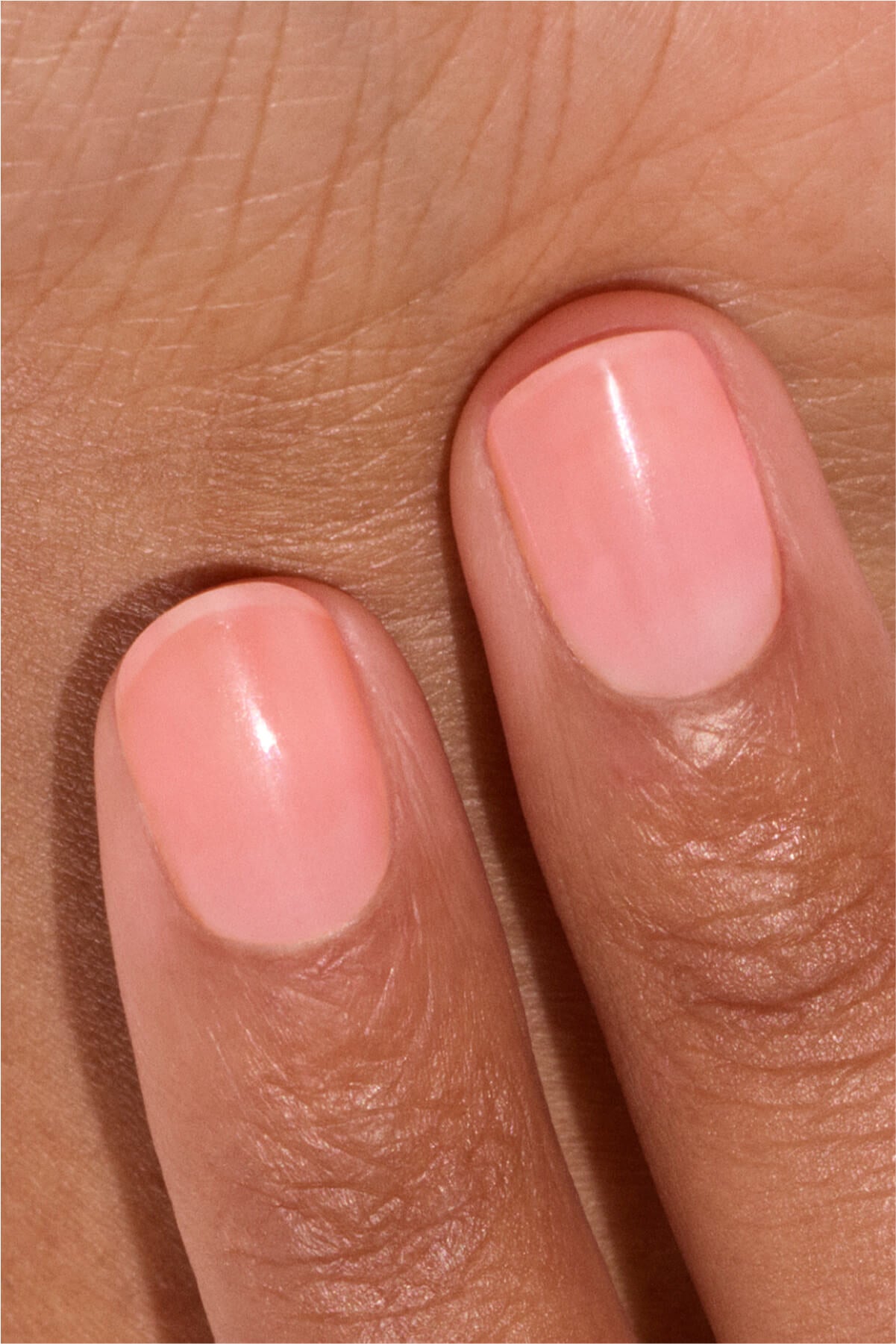
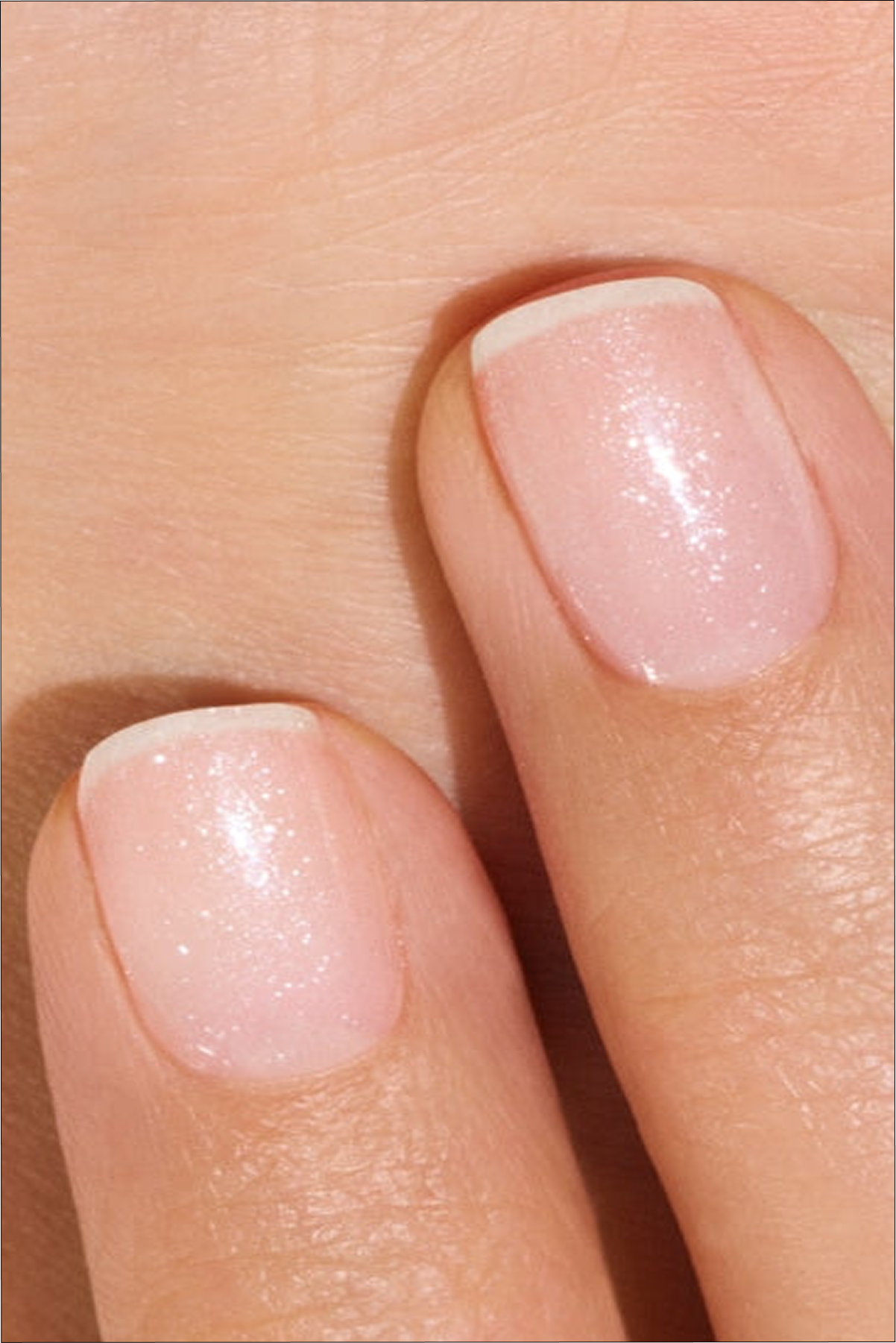
Red Cherry and Pale Rose, the perfect red and pink shades for neutral subtons.
The drapping method
It's THE technique used by image consulting professionals. The principle is simple: place different coloured fabrics under the face to observe the reactions of the complexion. Some colours seem to smooth out the lines, reveal the natural shine of the skin, reduce the dark circles and make the look more sparkling. Conversely, others accentuate shadows, redness or fatigue. Drapping allows you to determine your colorimetric profile and chromatic season with more precision.
The limits of online colorimetry tests
The tests available on the Internet are often fun and are a first approach. The Commission has a number of guidelines for the implementation of the programme. light from your screen, the camera filters, Makeup or White balance can change the perception of colours. As a result, two photos taken within minutes of the time range can lead to two different diagnoses.
The online tools therefore allow for discover the basics of face colorimetry, but they do not replace an observation by a person in real-life conditions.

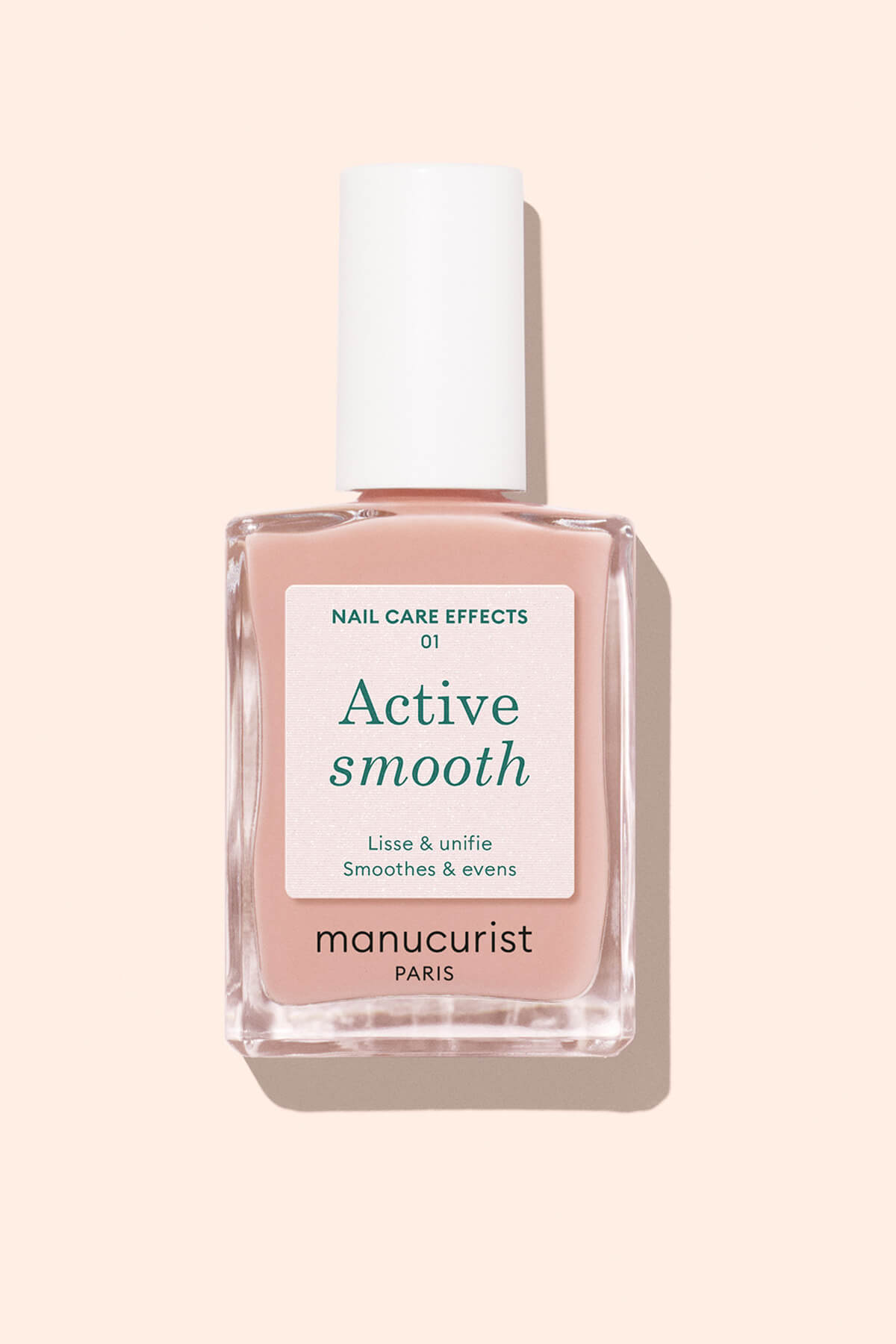
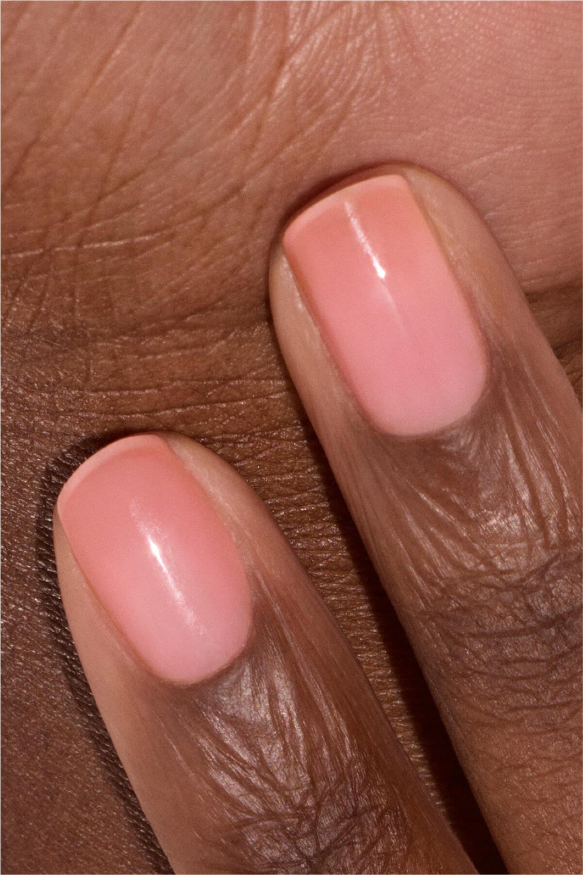
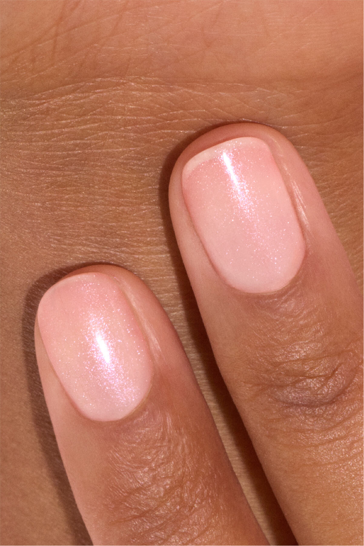
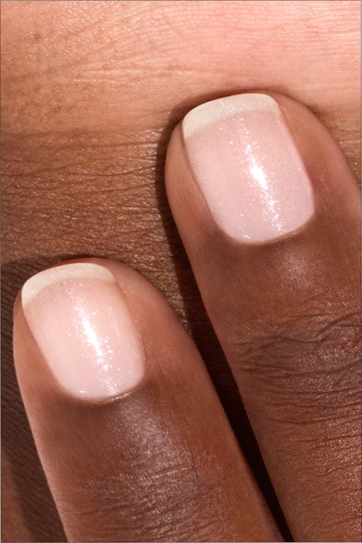
Do you have a hot subton? Bet on Milky Peach or Lava for your pink or red manicure.
The 4 seasons of colorimetry
The four-season method is today the most widespread. It is an initial colorimetry system. developed in 1942 by Suzanne Caygill, stylist and American theoretician of color. This method aims to determine the harmony of colors that most enhances a person's natural characteristics (toned, eye colour, hair color) by associating it with one of the four seasons: Spring, Summer, Autumn and Winter.
These four seasons are defined by two main criteria:
- the temperature (cold or cold)
- the value (light or dark/deep)
Each of these seasons therefore corresponds to a combination of temperature (hot or cold) and intensity (soft or contrasting). The goal is not to put you in a box, but toidentify the color family that will come to create the most harmony with your face.
Spring: the light palette
The profile of the woman or man Spring generally has a hot subton associated with bright and bright colours.
Characteristics : a complexion with golden or peach undertones, golden/red blond hair, light/cheath, warm light, bright and light eyes (blue, green, hazelnut).
The privileged palette of the Spring season : coral, fishing, salmon pink, mint green, light turquoise, golden yellow.
On the manicure side, you should prefer fresh and bright shades that reveal the natural shine of your carnation, respecting the balance of your warm subton. Opt for Bird of Paradise, Tangerine, Péonie, Lava, Riviera, Mimosa.


Summer: sweetness above all
The Summer profile belongs to the clear and cold pallets. Its colors are soft, slightly powdery and slightly contrasting.
Characteristics : a complexion with pink or blue undertones, ash/châtain blond hair, light ash, light eyes (blue, grey, green).
In the summer palette, we can find in particular the sky blue, powdery pink, lavender, water green, pearl grey.
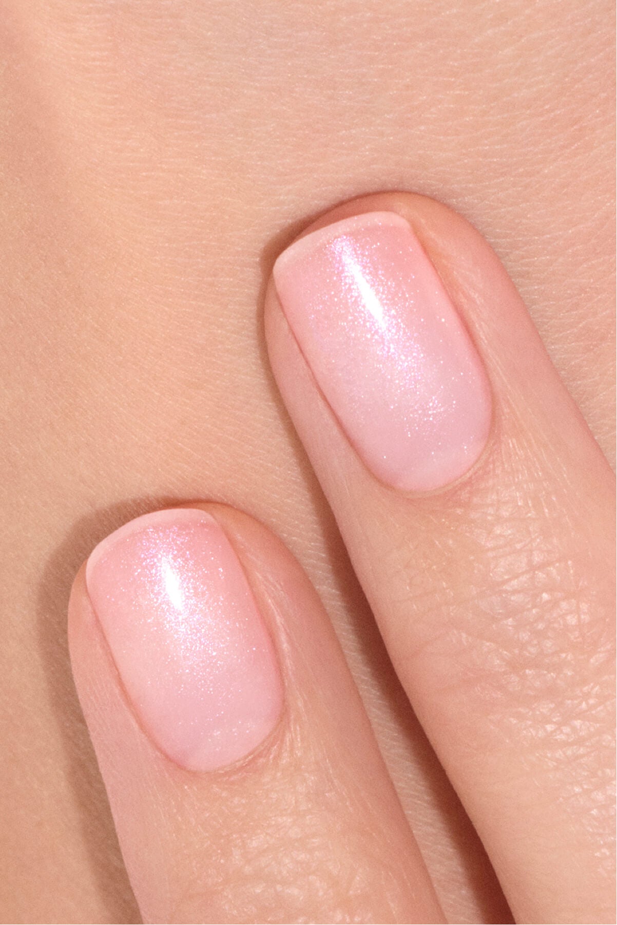
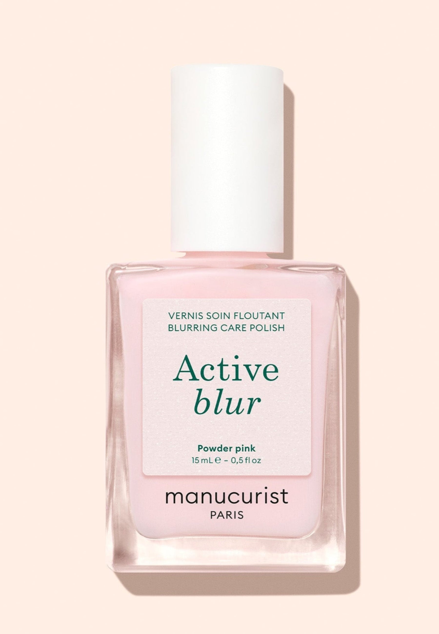
On the manicure side, bet on delicate shades that bring shine while remaining harmonious with cold and little contrasting carnations: Old Rose, Milky Pink, Lisa Lilas, Bubble, Mint, Tweed.


Autumn: warm colors
Autumn profiles are distinguished by a warm, deep and enveloping palette, with overall colors rich and earthy.
Characteristics : a complexion with golden undertones, peach or olive, red/auburn/hot chestnut hair, dark or green/noise eyes.
The autumn palette includes terracotta, caramel, khaki or olive green, hot burgundy, ocre, mustard, warm browns.
On the manicure side, you can also choose warm and deep shades that highlight the natural richness of your palette: Terracotta, Brique, Indian Summer, Grenat, Chestnut, Khaki.


An interesting little shade: we often distinguish the Spring and Autumn as two warm palletsBut they don't tell the same story. Spring warm and bright (coral, peach, turquoise, soft green...) while Autumn is warm and deep (Terracotta, khaki, copper...). A useful reminder that makes it clear that not only the temperature of the color counts, but also its intensity and depth!
Winter: the contrast assumed
Winter profile belongs to the Cold, intense and very contrasting pallets.
Characteristics : a strong natural contrast, a very light (porcelain) or dark to cold undertone, black/dark brown/pepper and salt hair, intense eyes (steel blue, dark brown, emerald).
The flagship colors of the Winter are those that highlight the faces that show a significant natural contrast between skin, eyes and hair: black, pure white, navy blue, bright red, fuchsia, and fir green.
Manicure side, bet on Red Cherry, Pomegranate, Prune, Navy Blue, Hollyhock, Licorice.


How to use its colorimetry on a daily basis?
Once your colorimetric profile is identified, it becomes a guide to make harmonious outfits, choose your accessories and even, we saw, choose the colors of your ideal manicure. The idea is not to follow strict rules but to have a range of references that makes your choices easier on a daily basis.
Choose clothing adapted to its pallet
The Colouring of clothing allows to build a more coherent wardrobe, where colors naturally match one another.
If you belong to a warm pallet (Spring or Autumn), you can choose sunny shades that highlight golden subtons such as terracotta, camel, coral or khaki. In contrast, the Cold profiles (Summer and Winter) will often be highlighted by shades such as marine blue, raspberry, plum, pearl grey or emerald green.
Find the right shades of makeup... and hair
Colorimetry does not stop at clothes. It can also guide the choice of lipstick, foundation, eye shadow or color.
One hot subton generally agree with golden, peach or coppery nuances, while a cold subton will be enhanced by cold roses, ash browns and reds with blue subtons. The goal is always the same: to create harmony between your face and the colors you choose to apply.

With colorimetry, say goodbye to the fake fashion steps and the dull make-up. (@dagmarajarzynka, @first.gloss)
And manicure?
The hands naturally attract the eye. A well chosen varnish colour can therefore prolong this harmony. There is no "forbidden" palette, but some color families are more naturally talking with your carnation. For example, we saw that:
- The Spring profiles Often enjoy the shades of bright coral nail polish, fresh pink or orange red.
- The Summer profiles turn easily to powdery pink nail polishes, delicate purple or slightly bluish red.
- The Autumn profiles like terracotta varnishes, gourmet browns, warm burgundy or khaki green.
- The Winter profiles can bet on red varnishes, deep plums, intense blue or sophisticated black varnishes.

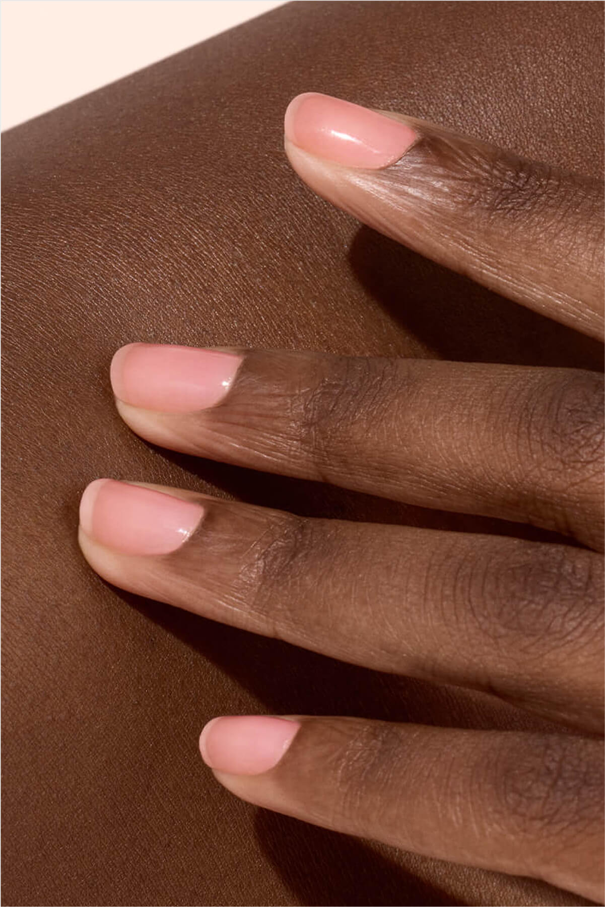
The good varnish for each colorimetric season: Bird of Paradise for Spring, Milky Pink for Summer, Indian Summer for Autumn, Plum for Winter.
And if you want to explore the symbolism of colours rather than their harmony with your complexion, our article dedicated to the Color Therapy Give you many inspirations!
The rule of three colors
You may know this trick used in image advice: to create a harmonious silhouette, limit your outfit to three main colours. For example: beige pants with a blue shirt and camel accessories. Your varnish can then take over one of these shades or play the role of a coloured accent.
What are the signs of bad colorimetry?
The right palette often goes unnoticed while a less suitable color immediately jumps to the eye. Some clues can put you on the track.
The colors that tarnish the complexion
A slightly flattering color can:
- give the impression of a more grey or dull complexion,
- accentuate redness and mark the rings,
- harden the facial features,
- to draw more attention to small imperfections.
Conversely, a suitable color seems to naturally illuminate the face without any additional makeup. It's the whole point of colorimetry: create an impression of balance, before thinking about makeup or accessories.
The most frequent errors
When we discover colorimetry, some of the ideas we have received often come back.
❌ Believe a color is "universal" Black, for example, does not systematically compliment everyone. In some people, a deep navy blue or chocolate brown will create a softer result.
❌ Follow trends only : a fashionable color will not necessarily be the one that flatters you the most. Trends change each season while your palette remains relatively stable.
❌ Confound skin colour and skin subton - We saw it, it's the trap! Two people with similar carnations may belong to two completely different seasons.
Can we wear colors that are not in his palette?
Of course! Colorimetry is an inspirational tool, not a regulation to follow to the letter. If you love a color that is not in your palette, nothing prevents you from wearing it. A few tricks simply help to preserve harmony:
Remove this color from the face (for example, with pants or skirts).
Match it with a color of your palette,
Choose it in small touches thanks to accessories... or your manicure. This is one of the advantages of nail polish: it allows you to easily dare a trendy color, for a few days, without transforming all your wardrobe.

Do you hesitate between a baby pink, bright red or coral varnish? Follow your instincts and enjoy yourself!
Colorimetry is a great tool to better understand the colors that naturally enhance you. By identifying your subton and color palette, you can make harmonious outfits easier, choose a suitable make-up and select varnish colours that naturally fit your carnation. Keep one thing in mind: the best colour is the one that pleases you. Because beyond seasons and palettes, style is above all a way of expressing itself. So trust colorimetry but not forget your first instinct!
FAQ
How do I know what my colorimetry is?
You can start by identifying your own subton (hot, cold or neutral) using vein and gold and silver tests as seen above. But to determine your season accurately, don't hesitate to call on an image consultant who will perform the drapping method and help you define the color palette you will keep for life.
What's the best colorimetry test?
Dripping remains the most reliable method since it consists of directly comparing different colors under natural light. Online testing is a good first approach but their results can be influenced by the quality of photos or lighting.
Does colorimetry change with tanning?
No, the diagnosis doesn't change. Tanning temporarily changes the skin colour, but not its subton (hot, cold, neutral-hot, neutral-cold).). Your colorimetric profile remains the same, even if some colors may seem brighter in summer.
Is the black going to everyone?
Not necessarily. Black particularly highlights Winter profiles. Depending on your colorimetry, other shades such as navy blue, chocolate, mole or anthracite grey can create a more harmonious result.